Structuring publications in the news feed
If you wish, you can adjust your news feed to a form that suits you and even exclude publications from certain sources from it. News feed filters are located in the upper right corner of the VKontakte home page.
Transition to abbreviations and punctuation marks
Modern people, on average, read little paper books and write even less by hand. For many people, reading and writing today are replaced by Facebook, VKontakte or another favorite social network.
But even when communicating on the Internet, young people and girls constantly shorten words. They speak their own language, known only to them, and most importantly, they understand each other well. And it is believed that the more abbreviations, the higher the skill of the sender.
But even this seemed not enough to modern youth. They switched to a more complex language, which generally consists only of punctuation marks.
Russian poet A.S. Pushkin in the novel “Eugene Onegin” (1823-1831) wrote:
“Moscow... how much in this sound has merged for the Russian heart! How much resonated with him!”
Based on modern realities, the immortal lines of the classic can be transformed in relation to messages consisting of one point, as follows: “How much has merged at this point for the Russian heart.”
Let's consider what a single point sent or received can mean in different situations.
How to find out whether a person has read a VKontakte message or not?
Did the message get through? When you send a message to a person, first you see it on a pale blue, gray background (or a blue circle or blue dot next to it) - this means that the message has been sent, but the interlocutor has not yet read it. When he reads it, the pale blue background will disappear (that is, it will simply be on a white background).
Usually, until a person appears online, he will not read your message. However, if he receives copies of messages via email or mobile phone, it may turn out that in fact he has already read the text of the message, but you still see the message as unread.
This is what an unread message on VK looks like:
This is also unread, with a circle:
And this is the message read by the recipient, on a white background:
If you don’t see the difference and all your messages are on a white background - both read and unread - then the solution to the problem is here:
If a person is online, this does not mean that he will immediately read your message. He may notice that something has arrived, but he will decide for himself whether to read it or not. Maybe he has other things to do, he’s just reading the news feed and isn’t going to enter messages. Or maybe he saw that the message was from you and pretends that he didn’t notice.
The recipient of the message could also read the message and leave it “unread” if they used one of these methods:
The question often arises: why doesn’t a person respond to messages on VK? The point is that he doesn't have to answer you. Even if he read your message, he may want to remain silent. Therefore, you should not continue to flood your interlocutor with messages, he may simply block you and you will not be able to communicate with him at all.
So, when a person reads the message and whether he reads it at all depends only on him!
About the good
Traditionally, a spoonful of honey.
Login notifications.
I was really pleased with:
Security is an eternal problem of VK and this is not the fault of VK, but a consequence of its mass character. And the fact that the site is beginning to more actively encourage users to monitor who is sitting on their pages and where is very correct and necessary.
New column width.
This was by far the most infuriating moment of the old VK - that when scrolling on a user/community page, the width of the text column changed.
New fonts.
No more need to rack your eyes about VKontakte texts, hallelujah! By the way, VKontakte remains the most convenient in terms of the ability to compose complex content posts among all VK, Facebook and LiveJournal, if you remember what it is. LJ is more powerful, but less convenient, FB has absolutely scant functionality, and VK is great for running a thematic blog without spending money on the blog itself. The only negative before was that you could break your eyes about the sheets of text in VK.
For preserving the old.
Keeping in mind the epic redesign of Kinopoisk, I can’t help but be glad that the VK team did not follow fashion, retaining the unique VK interface features like the logic for deleting objects. I still don’t understand why this hasn’t become commonplace - after all, the ability to cancel an operation after it has been completed is much more convenient than the mandatory confirmations “Are you sure you want to do this?” originally from the shaggy 90s, if not earlier. This is one of the signature things of VKontakte, with which it goes against the generally accepted, and which distinguishes it for the better. It's good that it was preserved. It’s a pity that in other respects the VKontakte team is less resistant to fashion pressure.
Quickly send a playlist
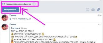
Sometimes you need to send a friend several songs from your playlist at once, but adding them one by one is quite tedious. However, just hold down the Ctrl key on Windows or Command on Mac and you can add any number of tracks by successively clicking “Attach”.
♥ ON TOPIC: What will happen to planet Earth if the Moon is destroyed.
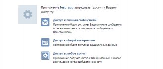
VKontakte will transfer messages to a separate application
The VTosters development team, which is developing a modified version of the VKontakte social network application for the Android operating system, discovered an extremely unexpected innovation in the latest beta version. We are talking about closing the message function with a forced request to install the VK Me messenger. Apparently, VKontakte does not learn from the mistakes of others, and will soon step on the same rake that its American competitor Facebook once stepped on. The authors of VTosters reported this in their Telegram channel of the same name.
The best Telegram channel about technology (possibly)
The banner in the above screenshot appeared in the beta version of VKontakte starting with version 5.31. In the latest update 5.34, the force_install_vk_me function was added, which does not allow correspondence within the main mobile application. The banner indicates that a separate VK Me application is available for communication, but it cannot be hidden or removed without installing the messenger from VKontakte. Considering that the innovation is being tested in beta, it will most likely be added to the stable version soon. The source notes that some users in Kazakhstan are already seeing such a banner in test mode.
A banner in the beta version of VKontakte for Android, informing about the transfer of messages to a separate application. Source: Trashbox.ru
It is noteworthy that the force_install_vk_me function belongs to the so-called toggles - these are hidden features that are activated by developers on the server side. For example, the dark theme on VKontakte works according to this principle.
Let us remind you that VKontakte announced the start of open testing of a separate messenger VK Me in December 2021. Currently, the application is available only in Kazakhstan, where 7.3 million people use the social network per month. The launch of the service in Russia has not yet been announced. VK Me can also be downloaded on Trashbox.
“We are talking about an experiment for some VKontakte users in Kazakhstan. We will monitor the results, analyze feedback and look at the demand for the new application in Kazakhstan. We are not going to change anything dramatically for all users,” from a commentary from the VKontakte press service.
VK Me 1.37 Android 5.1 and higher
Search for books and stories (Files tab)
VKontakte provides the opportunity to search not only for films and TV series, but also for books or other text materials. To do this, simply open the "Files" tab in the column on the left under the "Messages" and "Groups" sections. If the tab is not visible on the screen, hover your mouse over any item in the left menu and click on the gear icon that appears. Next, find the “Files” item in the menu and check the box.
Open the tab and enter the name of the book you need in the search bar. Due to copyright requirements, many works are removed from the social network, however, if you are interested in classic works, there should be no problems finding them. Moreover, the works are available in different formats, including epub for iPhone and iPad, fb2 for electronic readers, PDF, doc, etc.
About the bad
Indication of unread messages.
The biggest disadvantage, the inconvenience of which I fully appreciated even on the updated mobile application: it is obvious that unread messages highlighted in the background are much more visible than some kind of dot. At the same time, another dot also serves as an indicator of the user’s online presence.
Here, the designers of VKontakte - of course, cool and highly paid - make a typical, in fact, mistake: they try to cram in something that cannot be shoved in, giving the same element functions that are completely different in meaning. Look: the dot next to the avatar means that the user is online. Those. communication can take place. A dot next to a message means that it has not been read. Those. no communication occurred. Let's do this: a dot (for example, a red one) indicates that the user is absent: then it will be clear - the dot is always “broken off”. Or a dot will appear for read messages - then the dot will always symbolize positive feedback: online, read. Otherwise, with this point you send mixed feedback to users, which for a polished interface is worse than a stain on the toga of a Roman senator.
Unhealthy mobilization.
This has already become a general trend in successful and not-so-successful redesigns in recent years, starting, by the way, with Habr: the general mobilization of the population makes designers itch to drag techniques and styles onto the web from a completely foreign environment. As they once did in “thematic media,” VKontakte could not resist, and for some reason they also stuck the link, which did not bother anyone, from a prominent place in the drop-down menu. Public administrators will recognize this element:
From the point of view of ordinary users, everything is not so critical - only the “add to bookmarks” link and the new “subscribe to notifications” function are hidden under the flap. But to the question: why? How do we benefit from this radical space saving? - this doesn’t answer at all.
By the way, in the course of this optimization, it seems that they even lost one link: I don’t know whether the skis don’t work, or I’m barefoot
, but I have no idea where the community messages went in the new interface. Previously, there were not enough of them in the mobile application, but now, in a fit of enthusiasm for general mobilization, they were also introduced somewhere from the desktop version. It would be better to do everything the other way around.
Do you see the message? And it exists!
I wrote to support, we'll see.
Colors.
This, of course, is a matter of taste, I don’t even ask WHY it was necessary to change the color of the interface - the question is WHY EXACTLY THIS WAY. If you wanted to brighten it up and make it visually lighter, then you missed the mark: the new VKontakte color looks slightly faded, as if someone drew a new VK design on paper, and then forgot it for a month under the dim St. Petersburg sun - we just got some sunshine here, finally appear.
Let's say, if they made a new corporate color blue, it would be bright and fresh. Maybe even too bright - Twitter recently dimmed its colors. That is, apparently - well, I hope, at least - the VK somehow analyzed the issue, psychologists there and colorists were summoned to the Singer Tower for interrogation - and they chose this particular dull blue for some very smart and compelling reasons reasons. I would like to hear how, otherwise it looks like you ran out of paint in Photoshop. By the way, it would be a good idea for Adobe to punish pirates.
I really hope that all this is not in vain, and I will get used to these new colors, I will see life “as before” in nightmares - but so far the general impression of the picture is as if a spotlight was thrown into my eyes, and I am slightly blind - nothing I don’t see, just some outlines.
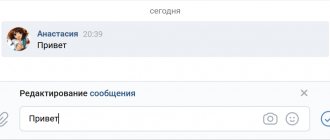
Messages.
In principle, the personal message has become more pleasant. But now the geographical center of the screen is occupied by a list of dialogues instead of the dialogue itself - to read what is actually being said, you need to squint your eye to the right. If in the coming years, Russian ophthalmologists have a significant increase in work, they will have to thank the VKontakte office for this.
And it’s a little worrying that the chances of a glitch, when you seem to have clicked/tapped on the user on the left, but in reality you haven’t, but you’re already writing him a message about what kind of woodpecker your previous interlocutor was, will increase. In the old interface, the transition between messages was a little clearer. Of course, only technical support operators working through VK will appreciate the function: you can now open a new dialogue in one click, not two. But for an ordinary user who does not need to conduct 11 conversations at the same time, this design may require more concentration than usual.
New menu.
I will probably miss the horizontal top menu.
Let's say, one of the frequent ways to use VK for me was in two clicks: Home → Comments
- go to new comments on my posts. These two clicks have been preserved, but now they are located not at the top, but on opposite sides of the text column:
Was
It became
What's the point? This cannot be explained by general mobilization: in the mobile version, of course, there is no top horizontal menu. But there is no right side one either - somehow everything fits into one left main one. By the way, I always liked how notifications about likes and comments are implemented in the application: there are two tabs in the “Notifications” menu item - fortunately, this has been preserved in the new version of the app. The division into answers/comments placed in different corners of the interface of the web version of VK was absolutely incomprehensible to me, but I put up with it, considering it an atavism of past times. But the radical nature of the current reform has not changed the essence: until now, comments are in one place - in a distant menu item on the right, and notifications about likes and other things are still in another: now they have moved under the bell in the header. FOR WHAT? Why can't they be made side by side? Why can’t we recognize the importance of these points for people and put notifications and comments in the left main menu? Yes, this will ruin the internal logic - they say, the left menu for sections of the site - YES AND I DO NOT CARE. That’s what’s done in the app – and you probably won’t come up with anything more convenient anyway.
What does the green dot mean in VK
Does this mean that the person on the phone has logged in? Just yesterday my friend was online, but from a computer, and what was shown was supposedly from a phone. how can this be? How can you know for sure whether a person came in from your phone or not?
Woman.ru experts
Find out the opinion of an expert on your topic
Slobodyanik Marina Valerievna
Psychologist. Specialist from the site b17.ru
Zinovieva Natalya Yurievna
Psychologist. Specialist from the site b17.ru
Dyachenko Elena Vladimirovna
Psychologist, Gestalt therapist in training. Specialist from the site b17.ru
Nikulina Marina
Psychologist. Specialist from the site b17.ru
Sheludyakov Sergey
Psychologist, Clinical psychologist. Specialist from the site b17.ru
Trifonova Maria Anatolyevna
Psychologist. Specialist from the site b17.ru
Gundertailo Yulia Danilovna
Psychologist. Specialist from the site b17.ru
Vyacheslav Potapov
Wrzecinska Eva
Psychologist. Specialist from the site b17.ru
How can I prevent people from sending me messages?
Go to the VKontakte settings (where they are, see here), then to “Privacy” and find under the “Contact me” heading the “Who can write me private messages” setting. There you can choose one of the options:
- All users
- Only friends
- Friends and friends of friends
- Nobody
- Everything except.
- Some friends
- Some friends lists
That is, for example, to allow only friends to write you private messages and prohibit others from writing you, you need to select “Friends only.” Once you select, your selection will be saved automatically.
And if you want to prevent a specific person from sending you messages, just block that person.