Our website already has information on how to create a VKontakte community and how to design it beautifully; today we will dwell in more detail on the description of the group.
A person who finds himself in a VKontakte group for the first time does not know where he is, what he can get here and whether it will be useful/interesting for him. To clarify these issues, the community should have some kind of annotation.
Receive up to 18% of expenses on contextual and targeted advertising!
We recommend : Click.ru – marketplace of advertising platforms:
- More than 2,000 advertising agencies and freelancers are already working with the service.
- You can connect yourself in 1 day.
- Earn from the first ruble spent, without initial restrictions, without an entry barrier.
- Payments via WebMoney, to a card to an individual, reinvestment in advertising.
- You still have direct access to advertising accounts, a paradise for accounting for document flow and payments.
Start earning money >> Advertising
Today we will take a closer look at where the community description is located, what it includes and how to compose it correctly. Let's look at successful examples. Plus: step-by-step instructions for publishing a description.
Design elements and their sizes
When you have created a public or group, you see an empty template in front of you.
Let's figure out what blocks we need to work on to get an attractive page.
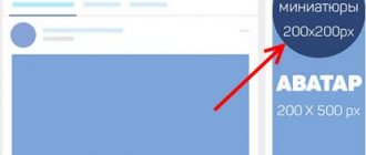
- The photo on the right is the group avatar, which will be shown in messages and notifications to subscribers. The minimum avatar size is 200×200 px, and the maximum is 200×500 px.
- The cover is the banner at the top of the screen. Its dimensions in the full version of VKontakte are 1,590 px in width and 400 px in height, in the mobile application - 1,196 px horizontally and 400 px vertically. Therefore, for correct display on different gadgets, you should not place significant elements on the sides of the cover.
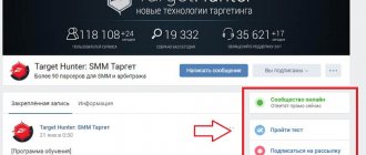
- Information about the public. This section will not contain pictures, but text that will help the visitor understand that this community is interesting to him.
- For business, you definitely need a “Products” section. It is displayed under the main information, the size of each photo is at least 400×400 px, maximum – 1,000×1,000 px. Read the article on how to add products to a group.
- Pictures for posts have a maximum width of 510 px; they can be the same or less in height. The size of the image for the post with the link is 537×240 px. The maximum width of illustrations on wiki pages is 607 px.
- Photo and video albums are also a design element. We have already looked at how to create albums on VKontakte. Here I will only touch on the cover parameters. Its maximum size is 1,200×800 px; the main page displays a reduced format – 200×132 px.
We have decided on the technical parameters. Now let's work on the design of the main sections.
Forming a group in VK
The design of VKontakte is an important point that attracts users to read content, subscribe, gain new knowledge, communicate, submit applications and much more.
The main advantages of successfully designing a VK community:
- Information content. The well-thought-out structure of the group allows you to talk step by step about the product and your brand, thereby providing useful material to subscribers. The structure can be created in the menu, tagged with hashtags or written articles.
- Visibility. Developing a unified style allows you to show basic information about the product, promotions and competitions. Graphic content attracts attention first, followed by text.
- Confidence. Neat and beautiful design makes users trust the brand. It also demonstrates the seriousness of the approach to business in communicating with clients, in processing transactions, and so on.
- Originality. The design of a VKontakte group should reflect the brand’s personality and be remembered by the audience.
- Economical. More detailed design allows you to introduce the client to the brand and tell about all the capabilities of the product. The user is able to independently find all the necessary information in your group, which saves you and your time searching for answers.
Avatar and thumbnail
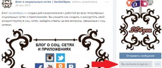
This is an image that is the “face” of the community. Users see it next to messages on behalf of the public and in the list of subscriptions. The purpose of this picture is to attract attention and be recognizable.
I'm designing a group for parents, and I have a ready-made logo. Now let's see what he will look like as an avatar. To do this, click “Upload photo” and select the desired picture.
I don't like that the image is cropped, so I enlarge the viewing area by pulling it up by the squares around the edges.
Now we set up the thumbnail that users will see next to messages. It is advisable that the text be quite large and not cut off, otherwise it will not be readable and will look sloppy.
I must admit that my avatar is not ideal, it is better if the picture is on a dark or bright background. But the main thing is to be recognized. If this is a company logo, then there is no need to change it. If you have the opportunity to choose, try to ensure that the main photo of the public is original and stands out among competitors. Here are examples of expressive images.
You can place short and useful information on your avatar:
- stock,
- company phone number,
- event announcement,
- the price of the main product,
- vacancies,
- Website address,
- office coordinates,
- call to subscribe.
Use all design elements to attract visitors and clients. But do not overload them with text, write only about the main thing.
Important: the image for the avatar must be of high quality, the text must be clear and fairly large.
Delayed recording
There are situations when you have written several posts in advance, but do not want to post them at once, or you are forced to be absent and you cannot disrupt the frequency of new posts. In this case, you can make a delayed recording. This means that you make an entry, but do not immediately send it for review, but set the date and time yourself when the entry should be published.
- Write something in the text line of the entry. You can add a photo or video. Just don't send it!
- Now click on “Attach”, select “Other” and select “Timer” from the drop-down list.
- You will be presented with a publication time form. For example, set your post to be posted on the wall on April 23, 2021 at 12:00, then click “Add to Queue.”
After this, you will see that at the beginning of the wall that you have one pending entry, and by clicking on it you will see it (or them, if there are several of them) and you can edit it or not wait for time, but click “Publish now”.
Cover
This element is the largest and most expressive in the entire page design. But keep in mind that when you add it, the avatar is removed from the page header. To upload a splash image, go to "Manage".
And next to the “Community Cover” inscription, click on the “Add” inscription.
In the window that opens, we are offered 2 options: make a regular or “live” cover. The last option assumes that you upload up to 5 photos and videos, which will replace each other at the top of the public page. I added a regular picture.
After that, close the window and refresh the page. Here's what I got.
Let's check what the picture looks like on a mobile phone.
If everything suits you, we move on. To make your cover more vibrant and useful to the community rather than just looking pretty on the page, you can add:
- a call to subscribe with a bright inscription or arrow,
- announcement of an important event,
- number of satisfied customers,
- company motto
- other relevant information.
You can also place videos, polls, and statistics in dynamic headers.
How to write a description of a VKontakte community
Everything is simple here. Under the VKontakte community avatar, click on the button with an ellipsis.
An action window will open in front of you. Click on the “Manage Community” button.
Immediately below the name of your page is the “Community Description” field, which you should fill out.
Well, now let's talk about what should be written in the community description.
Information
The description will help visitors understand what useful and interesting things they will get if they subscribe or join the group. Also in this section there is often a link to the website - the main web resource of the company or organization. If you did not add it immediately when creating the group, do it now in the “Management” section.
To add information about a community, simply click on the corresponding inscription on the main page.
This block does not have the ability to format the text beautifully, but you can add additional useful links and hashtags to increase the relevance of the page in search. When the text is ready, click on the “bird” in the upper right corner.
Where to start creating a VKontakte group
Setting a goal
First, you need to formulate your goals and objectives.
- You can create a group for direct sales. Your tasks include maintaining a group where you will present products, that is, write selling posts with a call to action. Talk about the company, your achievements and advantages, diluting the content with selections from your products.
- Increase brand awareness. That is, your task is to communicate easily with subscribers: talk about the company in a simple style, you can even make jokes, hold competitions and sweepstakes to increase audience involvement.
Important! The goal is the result you want to achieve. Tasks are the stages through which you will achieve your goal: product presentation, sales posts, competitions, promotions, articles, video reviews - active involvement of the audience.
Determining the target audience
Next, you need to determine the target audience and its interests. For e-commerce, you can use the 5W technique:
- What? (What) - what are you selling.
- Who? (Who) - who buys what you sell.
- Why? (Why) - the reasons why people buy your product.
- When? (When) - when they buy your product.
- Where? (Where) - where you can buy what you are selling.
Then you need to analyze the main points and needs of users - and based on the data obtained, develop a group layout and options for selling posts.
For example, you sell household appliances. Determine which audience buys products, which group of products is currently most interesting to users, who buys these products, what related products they are interested in, what objections they have.
To attract new subscribers, you need to highlight the main segment of your audience: who is more often interested in the product, asks questions, and buys your product. Describe your audience by characteristics: gender, age, geographic location, interests, pain points and needs. You can study the user profiles of your competitors: what they are interested in, who they follow, what they write on the wall, and so on.
For example, you want to tell users about your website development services. Show examples and lessons for reference. Determine: what audience is interested in this topic, what groups they are subscribed to, who is their leader in your topic, and so on. Based on this data, you can obtain audience portraits and identify a key segment for which you need to create post topics.
Create a VKontakte community
After determining the goals and interests of your target audience, you need to choose the type for your community.
What types of VKontakte communities are there:
Selecting a VK community type
- “Public Page” and “Business” are a group for building user loyalty towards your brand. Selling posts and useful content for your audience are posted here, which will motivate them to communicate. Suitable for news channels and organizations.
- “Thematic community” is a public page. Used to publish news posts to attract new subscribers and increase communication within the community. Suitable for blogs, media and posters.
- “Brand or organization” is a public page for companies with a narrow theme. For example, charities or educational institutions.
- “Interest group” - should unite users based on certain interests. These could be closed publics where you invite company employees or, for example, a group of fans of a movie or TV series.
- “Event” - inviting users to an event: concert, festival, birthday, seminar or webinar, and so on.
For example, we will show the creation of an “Interest Group”, enter the name, topic, type of group and address as desired:
Community creation
In the title, use the name of the brand, company, keyword, or your initials if you are creating a personal blog. It’s easy to find you in VKontakte search using key phrases or company name.
For example, if you are renovating apartments in Moscow, then it is better to use a keyword to attract users. If you have a store called Granny's Bagel, enter in the name: Granny's Bagel Bakery.
After completing all the settings for creating a community, a page with the group will open:
The group we created
You can go to settings by clicking the “Management” tab: inside you enter all the necessary information about your group. You can select sections, work through the menu and much more.
Settings in the "Management" section
Let's move on to the stages of creating VKontakte groups.
Pinned post
Designing a group correctly means making sure that visitors immediately understand that here they will receive interesting and necessary information. To do this, choose bright and useful material with an attractive headline and pin it at the very top of the news feed.
To pin a post, after publishing, hover over the menu icon in the right corner and select the desired action.
A post at the top of the page can replace the description of the community. It can be beautifully designed, place a navigation menu or useful links, and write down the group rules. The picture can be a continuation or addition to the avatar if a cover is not used. See how it looks in the sample.
Another way to grab the attention of visitors is to pin your video. When a user enters a community, this video automatically starts playing, but in order not to be too intrusive, it scrolls without sound. If a person is interested, he will adjust the volume himself. You can create short videos using the Supa video maker.
What else can be added to the community header:
- the most popular post that has already received a lot of likes and comments;
- announcement of an important event;
- message about discounts and promotions;
- practical jokes;
- surveys;
- customer reviews.
As well as any information that will help keep the attention of visitors and convince them to take action on the group page: subscribe, follow links, leave a request, like, share a post.
Examples of beautiful VK group design
An example of a laconic design for a creative blog. Beautiful cover and avatar design. A clear structure for constructing posts and photographs: object location and angles.
Example of VK group design
Stylish design option. Unified style of avatar and links. A clear structure for presenting posts and adding images.
An example of how to beautifully design a group on VK
An example of a simple group design, which is designed in a strict style. High quality photos, minimalistic group design.
Minimalist design of VK public
An example of how to create a VKontakte group. The bright design of graphic images attracts you to stop while scrolling the feed and read the posts.
Example of a VK Setters group design
An example of a simple group design. It's intuitive where to go, what to read, and where to ask a question. The authors talk about new opportunities, news from the world of cars and attract users with promotions and sweepstakes.
Design of the Delimobil group
An example of how to beautifully design a VKontakte group. Stylish and beautiful design of the Aviasales public page. Convenient menu for obtaining information about tickets and travel opportunities, applications and subscription to the newsletter. Useful articles are placed at the beginning, which means that users can read them immediately. Posts contain humorous content, news and selling texts.
VK public design
Tips for choosing and designing images
To make the image in the publication look beautiful and attract attention, it is best to make it a maximum size of 510x510 px. Then it will look good and stand out in the news feed on PCs and smartphones. It is better not to use a width less than 510 px.
A little trick: to make the quality of the pictures as good as possible, take a size 2 times larger than possible while maintaining the proportions. For example, you need to upload a photo 510x510 px, which means we take a photo of 1,020x1,020 px in size.
Picture with text
If you use a built-in editor to design a post, then it is best to take a dark picture and print white text on it. This way the message stands out and is readable.
If the text is typed on a plain background, then the optimal solution is to do the opposite - the background is light, preferably white, and the text is bright or dark. There are other techniques for highlighting text in an image:
- add effects: glow, stroke;
- do formatting: background color under the text, underlining, bold and italics;
- divide the picture into 2 parts and write an inscription on one of them;
- blur photo;
- choose photos that have free space for a text message. Look at the example in the photo.
Useful services
High-quality photographs are needed to make entries. You can find them on the following resources:
- unsplash.com
- rgbstock.com
- bigfoto.com
- picjumbo.com
- freemediagoo.com
- everystockphoto.com
- www.wylio.com
- pixabay.com
- dreamstime.com
- canweimage.com
- littlevisuals.co,
- freerangestock.com
- gratisography.com
- imcreator.com
- imagefree.com.
For additional image processing, it is advisable to have designer skills, but there are services that will help if you are new to this business. Good resources are fotor.com and canva.com.
Other design elements
We have looked at the main blocks that need to be worked out when you launch your VKontakte community. If some elements are not displayed on your page, go to “Management”, “Sections” and configure the display of the necessary items.
We can probably talk endlessly about page design. But I value your time, so I'll just briefly list some more elements that you can add to your group:
- personal greeting,
- discussions,
- wiki pages,
- navigation menu,
- links,
- tests,
- subscribe to the newsletter,
- documentation.
Go to the “Management”, “Applications” section. Here you will find many widgets and useful add-ons for communities.
VK community management via computer
Most often, editing a VK group is done via a PC, since the full version of the site is much more convenient and understandable than the mobile one. All processes in this manual are related to the Management section, the path to which is as follows:
- Log in to the group administrator account, from there go to the Groups section, where you click the Management tab.
- Click on the name of the community you are looking for, moving to its main page.
- Under the group avatar, find the Management item. Click on it.
Now you can examine in detail the procedure for editing a group.
Settings
The Settings tab contains several blocks at once. The first one is Basic Information, where you can change the group name, description and type. Using the Upload hyperlink, you can add or change the group cover. And in the Address line, write down the letter code of the group page.
The following block is designed to work with an action button:
- after turning it on, you can select or change the type of action (open a website, make a phone call, write an email, etc.);
- depending on the selected type of action, indicate the contact for communication (phone number, email address, etc.);
- specify or change the name of the button (Contact/Write).
We recommend: How to promote a group on VK for free
The Additional information block allows you to set the topic and theme of the group, as well as age restrictions. If necessary, here you can change the contact phone number, the address of a third-party website, or the actual address of the company.
Attention! After all the changes have been made, be sure to save them using the button at the bottom of the screen!
Sections
In this tab you can adjust the availability of various sections and blocks in the community structure:
- open or close a wall;
- hide, open or restrict access to photographs, videos, materials, discussions, documents;
- enable or disable the Events and Products blocks;
- change the settings of the Products block (delivery region, currency, store contact information, etc.);
- determine the main and secondary blocks.
In addition, if necessary, you can connect the Store application here. To do this, check the box next to the corresponding line and click the Save button.
Comments
This tab is for editing the comments option. You can enable a keyword filter or block messages containing obscene language by checking the required items in the list of settings.
At the bottom of the screen you can see messages that have been removed for ethical reasons.
Links
This tab has only one function - adding relevant links to other VK pages or third-party resources. This will help make the community more informative and ensure a steady flow of visitors to the main site.
Addresses
The full name of the section is Addresses and opening hours, from which it is clear that here you can indicate the actual address of the company (if available), add geolocation, phone number and opening hours. For groups that represent a virtual representation of an offline business, this option is extremely important because it creates the impression of openness and accessibility among both current and potential clients.
Working with the API
This tab allows you to generate group access keys. As a rule, they are used by the most advanced SMM specialists. And for beginners, it’s enough to know that the API key is a kind of virtual signature of the user or VK community.
We recommend: The community probably contains inappropriate materials VKontakte iphone
Participants
In the “Participants” section, you can search for information about users who have subscribed to the community, grant them privileges, or add them to the Black List.
Messages
Here you can enable the Community messages option, after which the corresponding block will appear in the left column of the menu. In a special text field, you can write the actual greeting text, which will be automatically sent to users who start a dialogue with the bot.
Applications
In this section, you can connect or remove applications necessary for the effective functioning of the community.
Money transfers
This section is intended to regulate the function of monetary relationships between users in the group.
Content Complaints
Here you can see negative reviews of posts in the community.
