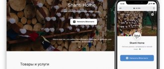
On the VK social network, the mobile version with computer login is in great demand. Users’ reasons may be very different, but most often they are attracted to this use case by the absence of annoying advertising and a convenient, more familiar interface. This is not surprising, because today almost all people are on social networks via smartphones; these devices accompany us everywhere - on public transport, at school, at work, while walking, at home. Many people even take a shower without parting with their favorite phone and are afraid of missing an important message or news.
Fortunately, the mobile version is available not only on smartphones - anyone can log into VKontakte through the mobile version for a computer, because not everyone likes the full view of the platform. Therefore, next we will look at all the ways you can open the mobile version of the site on your PC.
VKontakte mobile application
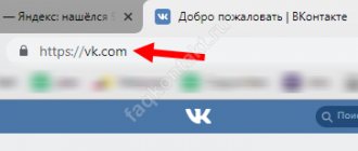
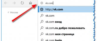
To log into VK through a computer or laptop with a mobile interface, you need to add the letter “m” in the address bar of your browser. before “vk”. The result will be https://m.vk.com.
You will notice the following distinctive features:
- large bold font for tab names;
- no advertising;
- accordingly, fast loading of the site;
- compact layout of all menu functions.
Due to the absence of unnecessary elements in the interface, the page loads faster and traffic is not wasted.
What are the advantages of the short version compared to the full version?
- It is more ergonomic and compact;
- The font and symbols are larger in size;
- The interface is not burdened with built-in targeted advertising, which often irritates users in the expanded format of the site and makes them think about removing it;
- Due to its lightweight form, it loads faster and works faster;
- There is an option to automatically adjust the window to the resolution of your monitor, which means there are no scroll bars.
Thus, the mobile version is a social network interface ideally adapted for a small screen with a wide range of capabilities. It allows the user to perform any operations on social media. network, and at the same time remains simple and intuitive to manage.
Now you know how to make a mobile version of VKontakte on your computer, and you can open the resource in 3 working ways. The simplest one is, of course, through the address bar of the browser. The emulator will allow you to play games in the telephone interface, just like on a smartphone. And Chrome options are convenient for users who use this browser. The choice is yours!
Program “VKontakte for computer”
Allows you to log into the application through a browser. Advantage – supports audio and video calls.
- The “BlueStacks App Player” application must be downloaded from the official website of the program. After installation, log in via gmail, thereby logging into Google Play. Then download the VKontakte application to disk.
- Browser extension “User Agent Switcher for Google Chrome”. You can download it from your computer on the official Google website. After installation, you will see a globe icon in your browser. Click on the button, a menu will appear in which you need to select the line Chrome on Android Mobile. Log in to your VK page via your computer and the mobile version of the site will open. Through the browser search bar
- A trivial method when you need to enter the request “mobile version of VKontakte” in the search bar of your browser. In the list of results, click the first site link. You will be taken to the VKontakte application.
Comparison of methods for creating mobile versions of websites
Not so long ago, having a responsive or mobile website became not a trend, but a real necessity - traffic from devices continues to grow, and users are already beginning to abandon large computers in favor of smartphones and tablets. To create such sites, three methods are now mainly used: adaptive layout, development of a separate mobile version and RESS. Johan Johansson published a comparison of these methods, the translation of which we present to your attention. There is a lot of text and pictures under the cut. It seems that the debate over mobile website technologies will not subside anytime soon. In these matters, Google, for example, adheres to the development of responsive web design, while Jakob Nielsen, a famous usability consultant, advocates the creation of separate mobile sites. The third option, which is already becoming popular, is when the web server generates the appropriate HTML and CSS depending on the device based on parameters received from the URL. In this article we will look at each of these methods and provide real-life examples.
An iPhone 4 with iOS 5.0 was used for testing.
Responsive web design
Responsive web design typically uses CSS3 Media Queries to adjust the layout of a web page based on the size of the viewport. You can use the same HTML to display different web page layouts for desktops, tablets, mobile devices, TVs, and more.
Advantages
- Content Security
: Your site retains content and HTML markup, regardless of the device you use. This approach will become increasingly important as more people use smartphones as their primary means of accessing the Web. - One URL for web pages
: This makes it easier to share content and eliminates unnecessary redirects to get the best page experience across devices (as opposed to separate mobile sites).
Flaws
- Content will not be fully optimized for mobile devices
: Unless you take a mobile-first approach, your site will contain the same information as its desktop brother. Compare this to a dedicated mobile site, where you could potentially tailor the content of web pages just for mobile users. - Slow
: According to data from January'13, the average web page today weighs about 1.3 MB. Theoretically, this size can be avoided by using responsive design, but in practice, 86% of “rubber sites” weigh exactly that much, or even more. - It can be difficult to navigate the site
: Mobile users tend to have different tasks than non-mobile users. In addition, they may be more accustomed to using the mobile version of the interface, and if you do not think through the navigation structure for each device, there may be usability problems.
Examples:
Starbucks
The Starbucks website is a great example demonstrating the pros and cons of responsive web design. All their content is available on mobile devices, every page uses the same URL, there are no redirects. Unfortunately, their site is heavy to load (about 15 seconds on a 3G smartphone) and requires a lot of scrolling to read the entire page.
results
: Average load time: 14.99 seconds Average page size: 1,193.88 KB Number of HTTP requests: 142
World Wildlife Fund
The WWF website is a good example of responsive web design. Navigation is optimized for mobile tasks. However, the loading time on a 3G smartphone leaves much to be desired (it takes about 7 seconds). Additionally, some internal pages (such as their confirmation form) were not optimized for mobile devices and remained unusable on a mobile device.
results
: Average load time: 6.91 seconds Average page size: 885.97 KB Number of HTTP requests: 72
The Boston Globe
The Boston Globe website is perhaps one of the best large-scale responsive design projects out there. The site uses rubberized images and optimizes JavaScript so that it does not affect performance on mobile devices.
Results:
Average load time: 5.55 seconds Average page size: 605.27 KB Number of HTTP requests: 87
Separate mobile site
To make a site mobile-friendly, some webmasters create separate sites. The most common story involves redirecting mobile users to a special subdomain (for example, mobile.examplesite.com for examplesite.com).
Advantages:
- It's easier to make changes to mobile and regular sites
: Changes can affect only the mobile version or only the regular version. - Fast loading times
: Since you are developing a mobile-only version, you can simplify and optimize it specifically for mobile devices. - Easier to navigate
: Navigation and content layouts are designed for the tasks performed by mobile users.
Flaws:
- Multiple URLs for each page
: Sharing a web page on social networks becomes a problem because mobile users will share the mobile URL, while regular users can also click on the link and go to the mobile version. To avoid duplicate content, SEOs should use rel=“alternative” and rel=“canonical” meta tags. Additionally, when a Google mobile search user clicks on a link in the results, they will be taken to the desktop version or redirected to the mobile version. But if the mobile version of this page does not exist, he will receive an error message. - Difference in content and functionality
: Creating a separate mobile site means getting rid of some of the content and functionality, resulting in a completely different user experience. Additionally, you may have two different sets of content, which can negatively impact your overall content strategy. - Redirects required
: Mobile users must be redirected to the optimized version and vice versa. Redirects are added to the page loading time. They can also have implications for your site's SEO.
Examples of dedicated mobile sites
Walmart
(mobile.walmart.com)
Walmart's standalone mobile site shows incredibly fast loading times of just 1.35 seconds
Results:
Average load time: 1.35 seconds Average page size: 272.29 KB Number of HTTP requests: 45
Amazon
(www.amazon.com/GP/AW/h.html)
Like Walmart, Amazon's mobile site loads faster than with responsive design (2.25 seconds).
It is strange, however, that not all pages on the site have mobile versions. For example, if you search on Google using a smartphone, many of the results will be for the “large” version of the site without redirecting to the mobile version. Additionally, if you access the mobile page from a desktop computer, you will not be redirected to the full version. Results:
Average load time: 2.25 seconds Average page size: 103.66 KB Number of HTTP requests: 16
BBC
(www.bbc.co.uk/mobile)
BBC mobile pages load faster than responsive pages (3.40 seconds), but redirecting users takes almost half that time (1.65 seconds).
Unlike the Amazon site, if you try to access the mobile page from a desktop computer, you will be automatically redirected back to the “large” version of the site. Results:
Average load time: 3.40 seconds Average page size: 56.04 KB Number of HTTP requests: 22
RESS: Output different HTML and CSS on one URL
This method of creating mobile sites uses server-side programming to create CSS and HTML for different devices.
That is, mobile users receive one set of code, while desktop users receive a different set of code. This is done in order to increase the efficiency of the site and works best in conjunction with adaptive layout. This method was called responsive web design + server-side software (RESS). When using this method, it is important that the Vary HTTP header type is enabled (details about this in Google Help, a guide to creating optimized websites) so that search robots will visit both the desktop and mobile versions.
Advantages:
- Easier to navigate
: The navigation structure can be customized for different tasks performed on mobile and desktop computers. - Fewer elements per page
: Instead of making page elements hidden for mobile devices, they can be removed from the HTML or CSS. This will reduce the amount of data downloaded and speed up loading times. - Fast load times
: Unneeded JavaScript can be stripped from HTML, which frees up CPU, memory and cache on the mobile device.
Flaws:
- Additional server resources required
: Dynamic HTML generation will increase the load on the server. - Device detection required
: Mobile users must be identified somehow, and device detection technology is not yet reliable enough.
RESS Examples
CNN
The mobile version uses a combination of HTML and CSS optimized for mobile, while the desktop version uses significantly more HTTP requests and JavaScript. Navigation is also specially designed specifically for mobile tasks.
Results:
Average load time: 3.46 seconds Average page size: 163.12 KB Number of HTTP requests: 28
eHow
Like CNN, the mobile version of eHow has customized HTML and CSS.
The top-level navigation is the same for both sites, with an emphasis on search and seven main categories. Results:
Average load time: 6.15 seconds Average page size: 188.95 KB Number of HTTP requests: 31
SlideShare
The mobile and desktop versions of SlideShare are completely different.
The mobile version uses responsive web design, while the desktop version does not. Each site uses different HTML and CSS. For example, the mobile version contains significantly less JavaScript. Each site also uses different navigation structures. Results:
Average load time: 6.15 seconds Average page size: 188.95 KB Number of HTTP requests: 31
Summary
In theory, responsive web design is the best solution. But in practice, most of these sites are implemented incorrectly and lead to increased loading times. My tests show that mobile sites have the best loading times, but there are significant drawbacks to this implementation of the task. In my opinion, it is best to use a combination of responsive web design and RESS. In this case, we get all the advantages of “fluid layout” and solve two big problems: the use of many files and slow loading. Dmitry Vasiliev, NetCat
: “For specialists - designers, planners, layout designers - an adaptive website is a much more interesting task than the traditional combination of wide-format and mobile websites.” But the disadvantages of responsive websites are described in some detail in the article. I would also add the complexity of preparing content after the site is launched. Imagine: the secretary is tasked with putting a large photo of the director and a table with important milestones in the history of development in the “About the Company” section. Of course, she won't be able to prepare adaptive content even if she wants to. The right approach is to delegate the task to a professional, but by doing so we increase the cost of website ownership for the user.
But there are sites that are objectively better to initially make adaptive. For example, these are corporate business cards or other sites without complex functionality. And we believe that the developer should have a choice. Therefore, a site running NetCat can operate in one of three modes: a regular site, a mobile version of a regular site, and a responsive site (and all system modules also support these modes).
As for RESS, this is an interesting approach, but it does not solve all the problems associated with adaptive layout. In addition, it is often better to offer a smartphone user a choice between viewing a regular website or a mobile one, because the scenarios for using the web on phones can be different. For example, I often go to Afisha from my phone. If I want to choose a movie or a cafe, I go to the regular version of the site; if I look where the movie I want is showing or find out some address, I go to the mobile version. And I am pleased that the site does not decide for me in what form to watch the content, but gives me a choice.
To summarize: I believe that for most tasks the “regular site plus mobile version” approach is the path of least resistance, since modern CMSs allow you to dramatically minimize the costs of creating a second site. But there won’t be a clear victory for any of the competing approaches in the near future.”
What methods do you use to create mobile websites? Share your thoughts on this topic in the comments or mark the poll option.
Music and video
In video recordings, you can only view videos that you have added to your playlist.
It is also possible to open videos in public pages and groups.
You cannot view live broadcasts on the mobile version.
Fig. 11 – viewing added videos
The music listening window has a search field, a full list of your tracks, and a “Popular” tab.
With its help, you can select new tracks that the system will offer you based on user preferences.
Previously added audio can be deleted . To do this, click on the three dots next to each entry.
You can't open your custom playlists on the mobile version.
Fig. 12 - music
MOBILITY CHECK
The best expert who can tell you whether your website is user-friendly is the visitor. Conduct a short test of your mobile version using the “Thoughts out loud” method.
Choose from your environment the one who best fits the description of your potential buyer: by age, profession, interests. Ask a volunteer to place an order - let him go through the entire buyer's journey. Just don't interfere or correct him.
Let everything be as realistic as possible - you won’t sit next to every visitor and explain where to click. Your test subject should comment out loud any difficulties or confusion.
And you continue to play the spy: analyze the actions and silently make notes in your notebook. You can only help as a last resort if the volunteer is in a completely dead-end situation.
Technical check
When you are sure that all the elements are in place and the interface is clear and predictable, move on to the technical side. Run the site through different services to collect errors and comments. If you can, fix it yourself, if not, you will know what to write in the technical specifications for the programmer.
1.1 Google Search Console is an official service from Google. It will show you what the site looks like on an average smartphone screen and give recommendations for improvement.
Remember we talked about the Mobile-first Index algorithm? The service is based on its work, so do not neglect this point.
Google Search Console
2. Yandex Webmaster - a similar service from Yandex. Before checking here, you need to add the site to the Webmaster panel and confirm the rights to it (upload the small file provided).
Only then can you use the service by going to “Tools -> Checking mobile pages”. The thing is also useful - with recommendations and comments.
Yandex Webmaster
3. Check from Bing search. Yes, yes, there is such a search engine too. Even though very few people use it, they are not the ones you need right now. The service may see errors that the previous two will not pay attention to. Well, as they say, it can’t get any worse.
Verification from Bing search
Interesting. I also recommend checking your site for accessibility. This is easy to do with the ping admin monitoring service. It monitors your server and sends you a notification as soon as something stops working. Click and test -> Ping admin
Visual inspection
After technical checks, move on to visual ones. Of course, you can check the site from your phone, but your visitors have different devices - from widescreen flagships to budget smartphones.
To keep track of everyone, use services to display your site on different screens. Here are some of them:
1. responsinator.com – shows all popular devices at once on one page. There are ten of them in the service: Pixel 2 (and Androids in general), iPhones and iPads.
responsinator.com
2. iloveadaptive.com – you can choose which platforms to display at once, without mixing different devices. Among the additional goodies: in the upper right corner there are basic indicators of page loading speed.
iloveadaptive.com
3. quirktools.com – only displays one device at a time, but what a choice. All screens are divided into groups: modern smartphones, push-button phones, computers and TVs.
At the top is a convenient ruler with the screen size in pixels and additional functions for rotating and scrolling.
quirktools.com
There is a catch in the services - no matter how many times you try them, they will not give you a full display. Due to different platforms, technologies and development approaches, the picture on the service and on a real phone may differ - a pixel more, a pixel less.
In general, this does not greatly affect the quality of mobility, but it is better to keep this in mind.
By the way. You can find out exactly what screen size visitors use to visit you using the same metric. Statistics are located in “Standard reports -> Technologies -> Display resolutions”.
What about in Russia?
According to Mediascope, in 2021, 70.8% of people used the mobile Internet at least once. At the same time, among the population under 44 years of age, Internet penetration is already more than 90%.
And now about online shopping. According to Pwc, the pandemic in 2020 has only increased the popularity of mobile devices. Before coronavirus, 24% of users made purchases using mobile phones. Now the figure has increased to 39%. And if you add data on tablets here, it turns out that mobile devices are twice as fast as PCs.
About mobile traffic and new requirements for website design
The volume of mobile traffic in the world is colossal and continues to increase every day.
At the forefront of web development is now adaptability - a property that allows the site to be displayed correctly on screens of any size: even on tablets, even on smartphones, projectors, and TVs. Without any additional settings or dancing with a tambourine.
The screen of each device has a different diagonal, orientation, and aspect ratio. Naturally, if the site does not use an adaptive template, then the page will be displayed correctly only on a computer monitor, but not on a smartphone screen. In practice, responsive design looks like this:
In simple terms, the term “responsive” means a design that automatically adapts to the screen of each device. The term itself became famous thanks to the book “Responsive Web Design” authored by Ethan Marcotte. The book is very interesting not only for web developers, but also for those who are interested in how the process of creating design on the Internet works from a technical point of view. Highly recommend.
Galactic selection: 190 best books on Internet marketing
What does a responsive website look like?
Let's look at a real example of what a responsive website looks like on three different devices. For example, let’s take the website of the famous designer Simon Collison – colly.com.
This is how a responsive website is displayed on different devices: smartphones (with horizontal and vertical orientation), desktops and tablets (also with horizontal and vertical orientation)
What's important here? Firstly, the site is convenient for the visitor to open from any device. Secondly, all elements are displayed equally on the screens of all devices. Small elements and fonts remain readable.
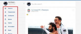
Functional
On m.vk.com you can use the same features as on a full-fledged social networking site. On the left side there is a menu with a list of sections. If you reduce the window with the tab to the size of a phone screen, the arrangement of the elements will change slightly:
To access the menu you need to click on the marked button. You can place the window with the social network in the corner of your desktop and go about your business - it’s extremely convenient. In the side menu you will find all the necessary sections, except for applications and games:
At the top of the interface there are buttons for quick access to messages and notifications:
The news feed is configured by clicking on the “News” button at the top of the page:
To return to the full site, you need to click on the “Full version” button at the bottom of the side menu:
After this, you will return to the full-fledged VK website. The described transition methods are working and completely free.
Groups and communities
The groups tab displays all the public pages and communities you are subscribed to.
To go to the desired page, simply click on the title.
The mobile version does not have a button to unsubscribe from each group.
To do this, you need to go to the community and unsubscribe manually.
Fig.8 - list of groups
Briefly about the main thing
So, if you take on the mobile version, then first choose the appropriate method, and then make sure that the developer does not cheat.
But before all this, make a good website prototype. After all, it’s one thing for everything to be displayed well, and another thing for everything to be sold. And for this, only the technical part is not enough.
And also, it’s a pity that you are only now thinking about the mobile version. The times when they said that this was very important have already passed, but the mobile revolution has arrived. Now adapting a website for smartphones is a default feature. Our expert advice to you - cast aside your doubts and get down to business.