For everyone who wants to learn how to make a VK cover in a group, we have good news - we have created detailed instructions that will help you do this! We will also tell you how you can process an image in special programs so that it becomes a real decoration for your public page.
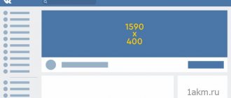
Before setting a cover in a group on VK, you should find out the parameters that your image should meet. Your photo must be in PNG, JPG or GIF format, and its resolution must be 1590 by 400 megapixels. And, of course, you will need public administrator rights; adding them is not difficult. Therefore, if you were able to create a group on your own, then you will probably be able to cope with the subsequent instructions.
Why does a group need decoration?
The functionality of social networks allows you to design groups with images. It can be not only beautiful, but also useful; it is a good way to solve several problems at once. It can:
- indicate the theme and direction of the group;
- save users time on exploring the community;
- display contact details in a prominent place;
- create the right mood and thematic atmosphere;
- motivate comments and likes;
- perform other special functions.
Social networks have different options for creating a group; let’s look at the functionality on VKontakte.
Selection rules
Before you make a header at the top of a VK group, it’s worth learning a few important rules. Follow the set parameters, then the picture will fit on the page in the best possible way! The image must contain the following information:
- A clear and understandable public title that will allow the user to understand the purpose of visiting the page;
- If possible and if necessary, decipher the title using a subtitle;
- Logo. It should be high quality, attractive and reflect the essence of the page. You should not put a low-quality or someone else’s logo;
- Communication methods. You can use your phone, links to social networks, or other additional sources of information. This is especially true if the public implies constant direct communication with clients;
- Product image. If you sell specific products and services, demonstrate them in person - this will attract potential consumers;
- Menu for main sections - make clickable buttons for quick transition;
- Photography similar in theme. Be sure to make a beautiful, bright cover that will make people pay attention to your public page.
Follow our simple tips - everything will work out! It is worth remembering the most important principles of creating an attractive cover:
- Choose the color scheme carefully - all shades should be in harmony with each other;
- Do not overload the photo with text and hashtags - this is unnecessary;
- The font should be simple and pleasing to the eye;
- Choose only high quality;
- Images must be original and directly related to the main topic.
Does not work? Find a small guide on the main difficulties that the user faces.
Cover
Dimensions: 1590×400 px, visible area for mobile version 1196×400 px.
This is an elongated horizontal image in the community header; it is not clickable.
Cover of our group vk.com/prcyru
The cover is not required for the community; if you do not install it, the group avatar will open in full format on the right.
Group without cover
General recommendations for the cover
To prevent the quality of the cover from deteriorating, the VKontakte administration advises uploading an image with a size of 1590×400 px. But in the mobile version, the entire cover does not fit on the screen, the edges on the right and left are cropped at 197px, so all data, texts and images that cannot be cut are better placed in the visible area, this is 1196x400 px. And on top, about 83 px, is a strip with indicators of communication, charge level and others.
Cover diagram with markings
To avoid marking the areas yourself, we have made a template in psd format with guides demarcating the areas. It's possible.
The inscriptions fit in the visible area, the settings icon overlaps the text only for community administrators
Part of the title on the cover was cut off
Many people advise putting arrows on the cover that encourage you to click on subscribe or write a message.
The arrow points to the submit button
The arrow points to a button with a message
We advise you to first look at what devices the audience primarily uses to watch the group. This information is available in community statistics:
Screenshot of PR-CY group statistics
If the audience more often watches the group from mobile phones, then such an icon makes no sense, because in the mobile application it is shifted and points to the avatar thumbnail, and not to the subscribe or message button.
The arrow points to the avatar
Arrow points to empty field
Dynamic cover
Dimensions: same as regular cover.
VKontakte has introduced a dynamic covers feature, which means that the cover will have changing data and be updated after a certain period of time. This cover is convenient because you can display almost anything on it: city portals may need time, exchange rates, traffic jams or weather, groups that hold promotions or organize events will benefit from a countdown timer, and displaying avatars of the most active Users can be encouraged to leave comments or like posts.
An example of displaying avatars of active participants on the cover
New subscriber's avatar on the cover
For a dynamic cover, you need a regular picture on which inserts with avatars, weather, etc. will be attached, a script linked to a group, and hosting with CronTAB support where the script will be installed. If you set the cover to update too frequently, every second, for example, you may need an anti-captcha.
Pyotr Samokhin talked about how to write a script yourself on HabraHabr. If you don’t want to figure this out yourself, there are paid design services to which you can connect a group and customize the cover with the necessary applications for a small subscription fee.
The functionality may be different, for example, the design of the community may completely change after clicking on the subscription. Additional functions are developed separately, you can write something yourself, you can find groups in the search on VKontakte itself, where they develop and sell such applications.
Animated cover for mobile
Dimensions: vertical photos and videos 1080×1920 px or others in a 9:16 ratio.
In January 2021, all groups were given the opportunity to design a separate cover for mobile viewing. It can include up to five large photos or videos without sound, which will work like a slide show. It looks like this:
Group cover in mobile view Group cover by click in mobile view
This feature can be enabled in Community Settings:
Group settings
Next, a window will appear with adding photos to the slideshow for the animated mobile cover:
Adding photos
What size of materials to choose:
For photos, we recommend a resolution of 1080×1920 or another in a 9:16 vertical aspect ratio. Video size is the same, duration up to 30 s, size up to 30 MB, MP4, H.264 video codec, AAC audio codec.
What is a VKontakte banner and why use it?
A banner is an advertising image. It can be both static and dynamic. Its role is to advertise a product/service or encourage action (subscribe, write, etc.).
In VKontakte communities, photographs in pinned posts, covers, or avatars are used as banner images. It all depends on how you design your community.
Let's look at an example of effective use of a banner. To do this, let’s turn to the “moloko_coffee” public page.
A dynamic cover was used here, which is located in the header. The guys set a timer that counted down the time until the end of the drawing, thereby encouraging customers to take part in time. They also did not forget about the visual component.
Thus, this banner fulfilled two tasks: advertising and stylish design of the group.
Avatar
Dimensions: no less than 200x500 px and no more than 7000 px, aspect ratio 2 to 5.
We recommend that you set a group avatar; without it, it can also function, but users may think that it is closed and not working.
If a group has a cover image, the avatar will be presented only as a thumbnail; the full version can be viewed by clicking. If there is no cover, it will be displayed in full. For comparison, the PR-CY group with a cover and avatar and a variant of the same group without a cover:
With cover and avatar
Only with an avatar
The avatar can be of any size, no less than 200x500 px and no more than 7000 px on each side, but the maximum aspect ratio is 2 to 5. That is, it won’t be possible to install a very elongated picture, we tried:
The editor does not allow you to select a more elongated field.
How to make a header banner
First, you will need to download and install one of the above programs on your computer. In our instructions we will use the Adobe Photoshop program.
- Let's launch the program.
- Let's open the image in it.
- Next, using the “CropTool” tool, create a frame measuring 1590 x 400 pixels.
- Next, select the displayed part and press Enter. The image will be cropped.
- Save.
Thus, we received a banner of the required size.
Now all we have to do is upload it to the group:
- Go to "Community Management".
- On the right, select the “Settings” section.
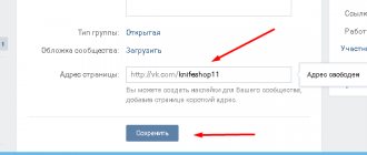
- Find the "Cover" line and click the "Upload" button.
- Select the file on your computer and then select the part to display.
- Save your changes.
The process in other editors is similar.
If you decide to make a banner from scratch (all design, style, text, etc.), then you will also need design skills.
Menu with buttons
Dimensions : image for the button from 376x266 pixels.
Groups recently had the option to add a menu feed. It looks like a horizontal block with buttons, a maximum of seven buttons. The administrator can attach a link to them, but only within the social network - to an article, post, products, application, something else. External links are not allowed, so you cannot create a “Go to site” button.
Menu ribbon in a group
You can manage the menu in the group settings - adjust the number of buttons, add a title, cover and link.
Customizing Menu Buttons
The name of the button cannot be more than 20 characters, but even these characters do not fit on a smartphone, so additionally check that the name is clear:
Menu on a smartphone
The minimum size for a button cover is 376x266 pixels, but it is better to make it larger in the same proportions. Menu buttons are a fairly small rectangle, especially on smartphones, so use all the design space and don't add text.
What sizes to choose for a VKontakte banner?
The second thing that is necessary is knowledge of the dimensions, since all images on VKontakte and the distances between them have their own parameters, which are important to take into account in your work. Their use will lead to better results.
Based on exactly how you will design your public page, use the appropriate sizes:
- Cover – 1590 x 400 pixels;
- Avatar – 200 x 500 pixels;
- Pinned post (square) – 510 x 510 pixels;
- Pinned post (at the level with the avatar) – 510 x 308 pixels.
Important! The above are the recommended sizes. If you use smaller parameters, the picture quality may deteriorate. When using large ones, the photo may not be displayed completely and you will have to select the visible part.
Wiki menu
Dimensions: inner page width 607 px, cover at least 600 px wide.
The VKontakte wiki format implies a page with the ability to format text, make lists and subheadings, insert clickable images with transitions to VKontakte sections and third-party sites.
In the wiki format, they often make a menu and pin it in the group header to make it easier to navigate the community and provide all the important information in one place. Navigation in the group will attract attention, but you will not be able to pin other important posts to the header.
With the introduction of menu buttons, the need for a pinned wiki menu is no longer necessary, but it can still be created if you need to put more than seven links in a menu.
For a wiki menu you will need a cover, which will serve as an illustration for the link to the menu page, and internal sections.
Menu cover
Fragment of sections inside the menu
The width of the field for wiki pages is 607 pixels. Pictures can be stretched or made smaller by specifying the size in the editor, which opens by clicking on the image. But when stretched and reduced, the quality deteriorates. Images are automatically loaded with a height of 400 px.
Wiki Image Editor
The wiki page with menu sections is configured in the editor. Next, a link to the page is inserted into a post on the wall; it is not necessary, but an image is desirable. It is selected as a regular illustration for a post. We attach and save the post, now the wiki page will open by clicking on “View” or on the illustration.
Test post with wiki menu
How to create a cover for a VK group in Canva
To make a cover, go to the main page of the service: canva.com and activate the 30-day free period (later you can cancel your subscription and use the service for free). You can use your Google account or Facebook profile to log in.
Step 1.
Once you're logged into Canva, start creating your cover. This can be done in two ways - manually, indicating the size of the “cap”. When you click the “Create VK Group Cover” button, Canva will open a new template with recommended dimensions—1590x400 pixels—and layout options.
Step 2.
If you don't know what to put on your cover, experiment with free layouts. Try out cover options, try changing the background color, position of inscriptions, frames and logos.
Step 3.
To change the cover background, upload your image to the editor by clicking on the “Downloads” icon and clicking on the “Upload your own images” button.
After uploading the image to the service, click on the picture. It will “fall” on top of the design. To make it the background, hold down the left mouse button and drag the image down. If you are not happy with the visible area on the cover, double-click on the background and move the image the way you want. Click the checkmark at the top to save your changes.
Step 4.
To add text to the cover, click on the “Text” icon and familiarize yourself with the types of inscriptions and fonts.
For any inscription you can define the font, size, color, letter and line spacing. Don't be afraid to experiment - all changes can be easily removed with the Ctrl+Z keyboard shortcut.
Step 5.
When the cover is ready, save the image by clicking on the “Download” button at the top of the menu.
The service will offer to choose a format - PNG, JPG and PDF (standard and for printing). For VKontakte it is better to use the first two formats.
All you have to do is click on the “Download” button, and in a few seconds the finished cover will be on your computer.
Posts
Dimensions: at least 700 px wide for regular posts, at least 510x288 px for an article in the editor.
Feed posts support any image, but different posts have their own limitations. There is an opinion on the Internet that the size of the image affects ranking in the smart feed, so it should be at least 1024 px. We asked support and found out that the size does not matter, the main thing is the content.
Support answer about the impact of image size on the position in the search results
The founder of Cerebro Target, Felix Zinatullin, claims that the image should be at least 700 pixels wide. As his experience shows, posts with images 700 pixels wide and 699 pixels wide can have a two-fold difference in coverage.
The picture parameters can be any, but it is better to stick to square and horizontal rectangular images. For example, we took three options: a square picture, images in vertical and horizontal orientation, 1000 px in width.
Desktop viewing
Images are aligned to the width of the screen, a square image takes up the most space, and the image looks good in horizontal orientation. In the vertical orientation in the desktop version, it is shifted to the side and is not aligned in the center, while in the mobile version it is in the center, but white fields are formed on the sides.
Mobile viewing
There is another post format - an article in the editor. The cover for it should be horizontal, the image will be compressed to a size of 510x288 px. It is better to place any images further from the center; there is no need to write a title either, it will automatically appear in the middle. The title is written in white font, but is highlighted with a shadow, so that dark illustrations look better, but the text is not lost on light ones.
Illustration for an article with a light background
Illustration for an article with a dark background
Another recommendation for pictures is not to write the words “like”, “repost”, etc. on them, which could theoretically be classified as cheating. VKontakte algorithms fight like-beggars and reduce the reach of such posts. This is evidenced by the Cerebro Target experiment: two identical posts received different coverage of subscribers, on one of them the “like” was blurred:
Reaches for identical posts
We create banners for VKontakte groups in editors
The first thing you need to create banner photos is the ability to work in various graphic editors. Unfortunately, today it will be very difficult to make a high-quality and stylish image without special skills.
If you do not have sufficient skills, then we can advise you to use the help of professionals or ready-made templates, which we will talk about in more detail later.
Programs that are most often used:
- Adobe Photoshop;
- Adobe Illustrator;
- GIMP.
These are the three most popular programs. If you have the skills to work in at least one of them, then it will not be difficult for you to create a truly beautiful and useful banner.
How to upload a finished image?
To upload a picture to the group you will need:
- Enter the community.
- Select an item to control from the menu.
- Find an option with a community cover.
- Select an item to download.
- An add form will open.
- You can select a picture in Explorer or drag it into the window.
- Upload it to the site.
- Confirm saving.
Go to the main community page and evaluate the result. If you followed the size recommendations, the picture will fit completely.
You learned how to create a cover for a group in VK. The process is not that complicated, it is enough to take into account all the tips provided.
Ready-made VK banner templates
Now let's look at how to make a banner in a VKontakte group without the knowledge of professional editors, which can take months to master. Take advantage of ready-made solutions.
Now let's talk about ready-made templates.
Firstly, there are sites where you can download any banners of the required sizes. These are sites such as:
- Vk-oblozhki.ru
- You-ps.ru
- Psd-box.at.ua
Secondly, you can use services where you can make your own stylish image online. Here you can add text, logos, etc. These are services such as:
- Fotor.com;
- Canva.com.
Using such software greatly simplifies the process of creating a group.
How to make an adjacent banner on VKontakte
Now let's move on to the most difficult and interesting part.
What are adjacent images? These are two or more separate photos that are a direct continuation of each other. This method is used to create not only public pages, but also profiles on VKontakte.
You can choose one of two banners:
- Adjacent Banner VK with cover;
- Adjacent to the avatar.
When creating the first one, it is necessary that both images coincide on the left edge.
When creating the second option, three points must be taken into account:
- Does the group have a status - it shifts the pinned part 10 - 20 pixels down;
- Does the post have text - it also moves the photo down (depending on the size of the text);
- Do you want the images to end at the bottom edge at the same level.
Let's say you decided to make a pinned banner that would end at the bottom on the same level as the avatar, but did not take into account the fact that there is a status that takes 20 pixels. And as a result, your left photo has moved down and does not match the right one.
It would seem like a trifle, but the result is no good. Therefore, be careful.
Now let's move on to the creation process itself:
- First, you need to take two blanks: the first – 200 x 500 pixels, the second – 510 x 308 pixels (you may have other parameters).
- Next, we load the first one into the place of the avatar, the second one into the place of recording.
- Then we take a screenshot.
- Load the screenshot into Photoshop.
- Next, click the second mouse button on the “CropTool” tool and select “SliceTool”.
- We select two areas with pixel accuracy.
- Remove the lock icon from the layer and make it invisible.
- We add an image and adjust it to fit our frames.
- We save the file for the Web. And in the settings select the JPEG format. It will be saved in html format, and the photos will be in the images folder.
- Then we load the images into their places.
In the end, this is what we got:
Looks pretty impressive. Just don't forget to add advertising, a link to the menu, etc. here.

