Hello friends! I am very glad to see you on my Blog! Today we will get acquainted with such a VKontakte function as a VKontakte cover for a group. If you don’t know how to add a cover to a VK group, then be sure to read this article to the end, as I will show you step-by-step instructions on how to do it correctly.
Nowadays, more and more entrepreneurs are appearing on the VKontakte social network, promoting their VKontakte businesses or making money from VKontakte groups. Therefore, for this it is necessary that our VK group be properly designed in order to attract our potential buyers and clients. Read about how to properly set up a VK group in this article.
Of course, we want our VK group to look very beautiful and presentable. Therefore, the VK cover for the group is a necessary thing that we must definitely use. What pictures to choose for the cover and how to create a cover for a VK group I will show you later in this article. Go!
VKontakte cover for a group - what is it?
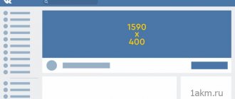
The VKontakte cover is the horizontal avatar at the top of the VKontakte group. The cover makes it possible to include more information for visitors. It is the group header, just like on the website, and immediately catches your eye when you enter the VK group.
The VKontakte cover is shown on mobile devices, which is a huge plus. When creating a cover, be careful, as the parts on the sides of the cover will not show on mobile phones.
How to make a public header with your own hands
Now you can start creating a picture for the public. Here is a simple algorithm that will help you do this quickly and without hassle:
- Take or select a ready-made horizontal photo that matches the theme of the group. It is best to take beautiful, unique pictures, a huge selection of which is presented in various photo stocks. If your budget is limited, you can try to find something suitable in Yandex.Images or Google.
- In order to strengthen the connection of the image with the topic of the public, you should add text and other elements to it. Great opportunities for this are offered by the online services Pablo, Canva or Fotor.
We recommend: How to hack a group on VKontakte
If the community requires a more complex, original avatar, then Photoshop is indispensable. Working with this program requires some preparation. Here is a short guide to help experienced users:
- Enter the program, click the "File" tab and the "New" button.
- Set the parameters of the new image: size 1590x400 pixels, RGB color mode 8 bits, resolution 72 pixels per inch.
- Create a collage of stock and personal photos. Experiment with inscriptions and decorative elements, use filters, change the background until you get the desired result.
VKontakte cover design for a group
To properly design a cover for a VK group, you only need to comply with a few important conditions.
- A headline that should be short and clear
- A subtitle that gives a brief explanation of what will be in this group
- Photo of the product you are advertising in this group
- Contact information (website address, phone number, address, email address, etc.)
- Call, where you tell the visitor what he needs to do (join the group)
Don't forget that brevity is the sister of talent. There should be a minimum amount of text on the cover so that it is convenient for a person to read and look at it.
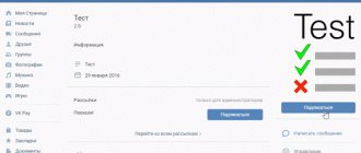
Here is an example of such a cover:
Why do you need a VKontakte group?
The VKontakte group is a modern way of promotion. It allows you to promote products and services, as well as earn money from advertising. A well-promoted public page on VKontakte can bring in a lot of money if you present your proposals using it correctly. VKontakte publics are great for anyone who makes money on the Internet or offline (that is, outside the Internet). The VKontakte group is easy to set up.
The VKontakte group is a simultaneous merger of a website, a forum and a chat. Because in a group you can not only add a description, post photos, but also maintain active communication with users, answer their questions and conduct surveys. With the help of the VKontakte group, you can support your brand by promoting it to the masses.
The most popular groups on the VKontakte social network are all kinds of life hacks, music and motivators. Remember how often you get stuck on the walls of such groups, scrolling through endless cool pictures. If you don't, this should be an eye-opener for you. The youth audience most often sticks to such public pages. Be in trend, and then you will become just as popular.
If you have a website or are just planning to create one, then the VKontakte group is an additional attraction for a new audience who uses only the VKontakte social network and searches for something not through Yandex or Google search, but uses the search of the social network itself. Therefore, creating a VKontakte group is a necessity to promote your business. 30% of the audience uses exclusively the social network VKontakte, giving preference to this particular resource.
Creating a VKontakte cover
To create a VKontakte cover for a group, you don’t need a lot of intelligence or effort. If you don’t have time to create a cover, and you are ready to spend from 300 – 700 rubles on creating a cover, then welcome to the Work-zilla service, where specialists in this matter will make the cover you need in a fairly short time. They will make you beautiful covers for VK.
If you have a limited budget and you want to do it yourself, then you can use an excellent service for creating beautiful banners and covers - the Canva service. This is a very convenient and free service for creating various banners for different social networks and more.
Sign up for Canva
In this article I will not describe how to create a cover there, I will give you my video instructions for creating a VKontakte cover.
Watch the video instructions below:
How to create a cover for a group on VK online
To create an elegant cover, you don't always need to download all kinds of programs. There is a convenient and multifunctional online service canva.com. Its wide range of advantages helps you painlessly make a hat for a VK group online in a few minutes.
1. Register first. Select 1 of 5 registration topics. Depending on your choice, the service will provide you with current templates. Further registration is very simple and consists of 3 options:
- via facebook;
- google account;
- standard via login - password.
2. Selecting a template and Adding your team - you can skip it as this can be done later. And since VK is not yet in the templates, on the “I want to create...” page, click “More types of designs.”
3. Click “Custom sizes” and specify the already familiar VK header sizes.
4. After moving to the “downloads” tab, click “Upload image”. Select the desired picture.
5. Afterwards, click on the downloaded image and it will appear in compressed form on the working field. Using black dots, stretch it to the desired size.
6. Filling. Canva offers a large set of features that will add a special twist to your cover:
- Elements is a collection of colorful additions.
- Text has a huge selection of fonts, but not the entire range works on the Russian keyboard.
- Background - gives you the opportunity not to use your own picture, choosing one of the proposed backgrounds or filling it with the color you like.
7. After preparation, in the recommended format, click “download”.
After these 7 steps, a free online cover created for the VK community is already subject to publication.
Canva helps create a beautiful header for a VK group, which has a very simple interface. Even a child can figure it out. And having understood all the intricacies and capabilities of the service, you can get a very original and stylish hat for your group.
How to make a VKontakte cover
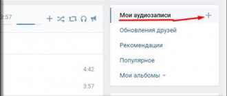
Now let's move on to the most important thing - adding a cover to the VKonakte group. In order to add a cover for a VK group, you need to go to the group itself and click on the button under the “ Manage ”
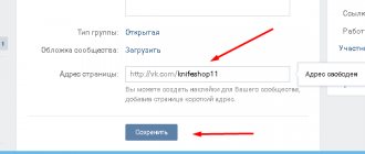
Next, go down a little lower and select “ Community Cover ” and select “ Add ”:
A page will appear in front of you where you will need to click on “ Add cover ” from your computer and select the cover you need. Next, click on the “ Open ” button:
After your cover has loaded, you click “ Save and Continue ”:
Next, a page will appear where VKontakte offers you to make a Live cover, which will change automatically, and it will look like an animated picture. If you are not going to make a Live Cover just yet, just click the cross at the top and close the window:
I will tell you how to create a Living Cover in the next article.
After you close the window, click the " Save " button in the settings and you can return to the group and check your cover.
Our VKontakte cover is ready:
Creating a header
To create a header, it is best to use the Photoshop graphic editor, since it can save image templates, which can be useful in the future. Open the program and in the top menu click “File” - “New” (or you can just press Ctrl+N if you are impatient).
In the window that opens, you need to specify the size of the image to be created. VKontakte requires a size with a width of 1590 and a height of 400 pixels. Specify it and make sure that in the right field next to the height and width you select “px” and not “cm”, otherwise the image will not fit on three monitors. Click OK.
The blank canvas is ready, now your creativity comes into play. Add each new image element as a different layer. Once finished, save the header template as a psd in case you need to edit the header in the future. For VK, save the header in jpg, png or gif format.
We recommend that you read the article on how to create a header for a YouTube channel, following the link.
How to change the cover of VKontakte
In order to change the cover of the community, move your mouse to the right corner of the cover and click on the button in the form of an upward arrow:
Now click on the “ Select file ” button and select a new cover on your computer and then click on “ Save and continue ”. After this, your VK cover will be added to your group.
How to make a hat on VK in a group in 5 minutes without knowledge of Photoshop + example
If you are interested, then let’s go study this topic and practice. Don’t forget to subscribe to the blog and my YouTube channel -))))) It’s a small thing for you, but I’m pleased and your support for the project will help.
So, dear friends, let's go to our community and if you haven't chosen a new design, then it's time to switch to it right now. The new design allows you to load a cool horizontal header, thereby turning our group into a mini-site with a menu, links, products and a “contact” section.
Before deleting the old cover, we need to prepare a canvas for the new one in Photoshop and find out its dimensions. I still couldn’t find the size, which was the problem with VK itself, and I had to look it up on the net.
Important: The size of the main cover must be 1590x400 pixels. This is the size of the main hat for our community.
But before you fill in something, you need to create and draw something. Here everyone is their own dreamer, the main thing is to know what you want. Let's open Photoshop and create our canvas with the required dimensions.
The next step is to overlay the image onto the background of the entire composition, or simply fill it with black for now.
Tip: It’s best to fill the background with black, which we will work with, and only then substitute the picture as I did in the video tutorial.
Creating a frame in Photoshop and inserting text
The next step is to create a frame, which we will make intermittent in the future and show you how to quickly turn it around to insert our text into the spaces. First of all, select the color white from the left menu at the bottom so that the default line is the color or another color you want to apply.
To do this, click on the “rectangular area” tool in the left side menu and draw our rectangle. Align it to the background and right-click inside and select “Stroke”.
Tip: To draw a frame, we need to create a new layer, otherwise the “outline” item will be inactive. Try to make each element on a new layer so that you can always delete and correct something.
Once the stroke is applied we need to set the thickness of our frame in pixels. In most cases, a thickness of 7 pixels will work fine. Select and click OK.
Great. We got a white frame in Photoshop and now we need to overlay text on the top border of the frame and the bottom. You need to use the key combination “Ctrl+D” to remove the dotted selection.
Here we simply select the “text” tool, select a beautiful font and write the inscriptions we need. I used the font for the text: Blogger Sans. At the top I wrote “AUTHOR’S BLOG”, and at the bottom “SEO-BLOGGING-EARNINGS”, well, in principle, this is the topic of my project.
I aligned all the text to the center and adjusted it to the size I needed. Next there will be a central inscription, which I want to make in a different font and decorate a little.
Now we have text that is covered by a frame. Let's show you how to draw our broken frame using the same rectangular marquee tool that we overlap the elements of our white cutting lines.
Tip: When do you use the line trimming tool? then we do everything on the clicked layer with the frame, and there is no need to create a new layer there.
As soon as we have selected the areas we need to cut out, press the key combination “Ctrl+Delete” and then remove the selection as I wrote above. This is the broken line we end up with:
The next step is to upload your company logo or avatar, or whatever you want using the “file-place” section.
How to apply texture to text in Photoshop
Now we move on to a more difficult and important element - this is the central inscription which will contain the main name (in my case, the address of my blog FIRELINKS.RU). For the text I chose the font: Phanton Extra Black. I will attach all the fonts to the article and under the video on my channel.
I usually write text with Caps Lock turned on to make it look more impressive. As soon as we have written the text, go to the “fx” effects section in the lower right menu and select embossing our text to give it a little volume. Set the settings as shown in the screenshot below:
To apply a texture (any picture) to our text and make it more colorful, we need to find the picture we need. My blog name, as you know, is translated as “FIRE LINKS,” and the topic should be related to fire and flame.
I found a picture of fire online (look in stocks or Yandex and Google images) and uploaded it to our project. Place the picture as if you were covering the text with it and apply it like a film and then cut it out.
IMPORTANT: The layer with the texture image must be above the layer with our text as shown in the picture above.
Now we need to overlay the image on our text. To do this, hold down the “Alt” button between the layers and press the left mouse button, thereby a black arrow will appear and the top layer will be applied to the bottom one, and we will get text with a fire texture.
Next, you can go to free scaling and align our image so that the bright parts emphasize our text and make it more colorful. Next, insert social network icons and write the addresses of your accounts.
In my case, I made some changes, which you can learn from my video and download the project itself. In the video I got a picture like this (I replaced only the background):
Live cover of the VK community: what is it and how to do it
This function appeared in the new VK design and is used very well in many popular communities. For example, I play Sony Playstation 4 and am a member of the community for this product to know the latest promotions and new games. This is where the live cover of the VK community is practiced in the form of a kind of slide show, with dynamic videos or pictures scrolling one after another. You can upload up to 5 large videos or photos.
The dimensions for a photo or video should be:
- 1080x1920 pixels4
- Duration no more than 30 seconds for video;
- Recorded in H.264 encoding (Premier makes everything simple);
- The file weight is no more than 30 MB.
If you have a video clip, then upload it to Premier Pro and adjust the dimensions of your frame in the sequence section and scale your video. It's simple.
An example of using live covers in groups.
Choosing a background for the cover of a VK group
The background screen of your public page should be as consistent as possible with its content and inspire confidence among visitors. Good results are shown by the author's photographs. Pictures of machines in production, cakes in your kitchen or satisfied clients in a hairdressing salon “come in” better than hackneyed pictures from Yandex search. If there are no such materials, you can use a free stock photo database, for example, Unsplash. The service offers a huge selection. But key queries must be entered in English. A good Russian-language stock is Pixabay. But the number of freely available files is limited.
However, you don’t have to be a designer to do everything yourself. You just need to know the basic rules and techniques.
Not only the text reveals the theme. A suitable illustration does this itself. It is enough to bring to the fore a key event, event or person.
In recognizable niches, you can adhere to a minimalist strategy. The brand comes first. An abundance of inscriptions, on the contrary, can ruin everything. A fan interested in the logo begins to study the details himself.
People are also attracted to feelings and emotions. A couple in love in the background creates a calm atmosphere, and the bright red font conveys the necessary information.
With the help of a community cover on VK, you can stimulate people to take a targeted action. A pointer to the menu encourages visitors to explore sections of the public. And if you make an intriguing signature nearby, they begin to look for a mysterious solution and linger with you.
An arrow pointing to the subscribe button helps users stay with you further. However, you should not limit yourself to just visual highlighting. Already at the first stage of getting to know the audience, you can interest them with a benefit or bonus. A nice gift, a promise to solve a problem, or a catchy phrase stimulates action.
In this case, not only direct, but also indirect levers of influence on the target audience are suitable. Marketers' research on eye trails has shown that we tend to look where others are looking. This can also be used to our advantage to focus on the elements we need. Despite the bright, expressive image of the characters, we concentrate on the text even without direct reference to it.
The latest VK innovations – dynamic covers for the group – help make the page interactive. The community header contains blocks that change over time. These can be neutral elements: clocks, exchange rates, weather in the region. But most of all, photos of friends and acquaintances attract attention. The built-in modules “most active”, “best commentator” or “last subscriber” show the avatar of the distinguished person in the header. However, there are many possibilities. We'll talk about them in a separate article.
Color solutions play an important role. A correctly selected range of colors attracts the target audience just as well as a catchy slogan. This is actively used by marketers. Orange and yellow tones are characteristic of cheerful people. Green is associated with health, sustainability and money. Blue – symbolizes calm and reliability. It is preferable for the male half of the participants. Shades of red perfectly attract attention. Indispensable for promotions and sales. Using more than three colors will unfocus the eye. It is better to use color resonance, shades and halftones.
A current picture for the cover of a group on VK helps you get into trends. An upcoming event always attracts attention. Announce relevant events even if you are focused on a broader topic.
