Continuing to tear off the veil of Photoshop, in this lesson we will create a VKontakte website. Of course, not the entire Vkontakte, but only the layout of one of its pages. However, they are all similar to each other. For a long time I have been promoting Photoshop's vector tools, in particular in my article Why Photoshop Needs a Vector. The time has come to put it into practice. For our experiments, I chose, not surprisingly, our group’s page. At the end of the lesson, we will recreate all its elements and get a finished file that each of you can download. For obvious reasons, I won’t be able to describe each step in 5 paragraphs, but I will try very hard to cover all aspects of creating a website in Photoshop. We will use fonts, masks, vector, styles. It is impossible to describe the alphabet of each instrument, but I will try.
How to make a website in Photoshop?
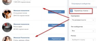
How to make any website in Photoshop? I chose VKontakte because of its popularity and simplicity. First of all, you open Photoshop and draw a website layout. In complex and expensive projects, the layout is created by specially hired people with systems thinking. They create an empty frame or wireframe where they place buttons, menus and site content. Next, the frame is transferred to the designer, and the designer “dresses” the frame, drawing the design and its elements on top of the frame. Why is this so? Not all designers are able to combine logic, common sense and a sense of beauty. Designers with a heightened sense of beauty especially suffer from this disease. They, the designers, are not able to understand that their sophisticated beauty is simply inconvenient to use. The thing about this beauty is that it is impossible to find the right section, the right menu, or the right materials. Therefore, the appearance and ergonomics of the site (clearness and simplicity) are different.
The drawn layout is transferred to the layout designer, who cuts the pictures into pieces and recreates the layout using HTML + CSS . The layout designer transfers the layout of the pages to the programmer, and the programmer prescribes the functionality, or installs the site on ready-made engines. We will focus on the design and layout stage. Since we have a layout (as well as a design), in this lesson I will simply recreate the VKontakte design, and I hope this lesson will at least partially answer the question - how to make a website in Photoshop.
What is a cover and what role does it play?
The cover of a VK online public page is a horizontal photo, image or screensaver (static or dynamic), which is located in the community header.
By default, when creating a group, there is no background. You can download or delete it at any time (read step-by-step instructions below).
Any person who visits a community page first of all sees the background (if there is one). This fact is quite enough to understand that its role is great. After all, she is responsible for the first impression of the group. And, as you yourself know, the first impression is the most important.
The background is the face of the group and reflects the attitude of the creators, both to the community itself and to subscribers. Below we will look at successful and interesting examples that helped not only give the VK public an interesting appearance, but also attract new participants.
How to download?
At first, as soon as this innovation was introduced, many wondered: how to put this cover?
Now we will explain in detail how to properly upload a background online.
First, you will need JPG, GIF or PNG files. These are the main and most popular image formats, so finding them won't be difficult.
Secondly, the exact dimensions of the image are 1590 x 400 pixels (the social network itself recommends uploading files with exactly these dimensions). Basically, exact dimensions are used when creating images in graphic editors (Photoshop, Illustrator, etc.). You, of course, can use any other size.
It is important to understand here that if you upload a smaller size, the quality on larger monitors will be significantly worse. And with a larger size, you will need to select a specific part of the picture, or select an exact match from the formats. Therefore, we agree with VKontakte and also recommend using dimensions of 1590 x 400 pixels.
Now the instructions themselves (You must be the owner or administrator):
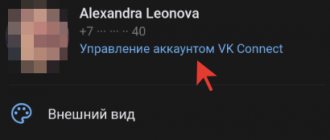
- On the public page, click the button with three dots and select “Community Management”;
- Next, in the “settings” section, find the line “Community cover” and click the “Download” button;
- In the window that opens, click the “Select file” button and select the file itself on your computer, in accordance with the recommendations;
- Next, select the visible part (if the image dimensions are inaccurate) and click the “Save and Continue” button;
- It is important to understand that the background has not yet appeared on the group page. In order for it to be displayed, you must confirm your actions again by clicking the “Save” button.
- Enjoy the results!
After these steps, your group will look completely different and users will be more willing to subscribe to you.
Also, when you hover over the cover, three buttons appear in the upper right corner:
- Download (if you want to install a new one);
- Edit (if you want to customize the current one);
- Delete.
Creating a workspace
First of all, we create the correct workspace. The VKontakte website is aligned in the center, there are no trailing backgrounds. Width of VKontakte 790px Length is infinite. The width is not random. VKontakte is designed for viewing from the most ancient monitors with the most ancient resolution of 800 by 600px . 10 additional pixels are margin for the browser scrollbar. In some cases, VKontakte is expanded in the Applications section. It expands due to the space between the logo and the menu, but this is not important to us. the File > New dialog box, create a working area of 800 x 600 pixels.
VKontakte cover size
VKontakte cover size is 1590x400 pixels.
The VKontakte cover is the so-called community header, it is located at the very top of the community:
In the full desktop (computer) version of the VKontakte website), the header/header size is 1590x400 pixels.
- In the mobile version of VKontakte (applications), the community cover will be cropped on the left and right by 197/200 pixels.
Everything that is in the range – these 197/200 pixels will not be visible on the screens of smartphones/mobile devices
Cover example
Tip: try to place the necessary information closer to the center: (This way it will definitely be visible from all smartphones)
- Recommendation: If you made the cover in Photoshop , save it via → save for web devices.
And upload via drag and drop : So VKontakte does not cut the picture, it does not blur.
Marking out the work area
Let's use Guides . Turn on the ruler Windows > Rulers or Ctrl+R , click on the ruler with the mouse, and without releasing the button, drag the guide to the beginning of the work area. Let's place the second guide pointwise, View > New Guides . In the window that appears, select Vertical guide and 790 px , the same width as the VKontakte site. Between these guides we will draw our VKontakte website in Photoshop.
Cover size for VKontakte photo album
This element is familiar to everyone without exception and does not raise any questions, but just in case, let’s describe the dimensions of the photo album cover.
Minimum size – 1200 x 800 pixel. It is important to remember that the title of the photo album will be written on the cover.
Cover dimensions for a VKontakte photo album
Aligning the work area
The dimensions are fine, but the site is squeezed to one side, and on the other side it has 10px gap. Let's align the work area by adding a few pixels on both sides. Go to Image > Canvas Size . In the Anchor , point the extension to the left. Check the Relative . Then the change in the size of the area will occur relative to the sizes that already exist. In the Width area , add 10px and click OK .
Now do the same thing, but this time leave the Anchor And expand the work area by another 40px so that the site is not visually cramped.
Creating site elements
It is not difficult to notice that all elements of the VKontakte are extremely simple and repetitive. This is the art of creating something pleasing to the eye, simple and unobtrusive. VKontakte elements are ideal for vectors in Photoshop and styles. To draw VKontakte elements, we use vector primitives of Photoshop, more about which you can read in my article Vector primitives in Photoshop.
We'll need the Layers panel, which can be opened in Windows > Layers . We will need to skillfully move elements. For this, the Move Tool , about which you can read more in my article Working with the Move Tool. And I would say that the Move Tool , since most of the time you will be pushing the layout elements into the right places and adjusting the distance between them. So, let's select the first Rounded Rectangle Tool and draw the site header. In the tool settings, set the roundness to no more than 5px and don’t forget about Snap to Pixels , with this checkbox the vector will be tied to pixel sizes, which is very important when creating graphics for the Web .
The VKontakte hat is rounded only on one side and this is how I cut the edges. I will select the Rectangle Tool , in the tool settings select Subtract from Shape area (-). With this setting, the tool will cut off parts of the drawn vector, rather than create new ones. Read more in my articles about Add, Subtract and Intersect settings. With the Subtract , select the vector mask in the layers and simply cut off the unnecessary part of the rectangle. Why is this beneficial? Firstly, you still have control over the mask as you create a complex figure. If you need rounded edges on the back of the shape, you can always get them by removing the second rectangle.
Dimensions Live covers for the VKontakte community.
We waited a long time and it happened, VK opened general access to downloading Live video covers. At the testing stage, this functionality was provided only to communities awarded the Promite sign and verified communities. But since the end of January 2019, all community owners have been able to add Live Covers to VKontakte mobile applications for IOS and Android.
Contact itself very poorly indicates the size of live covers; the recommended size of a live cover is 1080 x 1920 pixel. (width 1080 pixel, height 1920 pixel.
There are 3 download options:
- Upload up to 5 videos that will change automatically.
- Upload up to 5 images that will be automatically replaced
- Upload up to 5 images that will automatically change, but each image will be enlarged. (By default, this function is enabled, to cancel enlarging images, uncheck the Show photos in motion item.
If you look from the side of ordinary users who post stories on VKontakte, everything turns out cool and great, but if you look at the loading of live covers from the communities, we get as many as 6 options for user viewing. We all love to write the terms of promotions in capital letters throughout the entire space provided . Let's figure out how to properly make a live VKontakte cover. We discuss this topic in detail in a separate article; if you have any questions, be sure to read the detailed instructions for installing VKontakte Live Covers.
Uploading videos or photos without the “show photos in motion” function.
Let's define 2 cover visibility states:
- A shortened view (preview) of the live cover is the part of our cover that users see when they get to the community page.
- Full / Expanded Live Cover View – After clicking on the shortened view, users are shown the full cover.
Abridged view of the live cover
Full view of live cover
We face the first difficulty, if there are two options for viewing our cover, which option should we prepare our video or image for. Let's see what the Live cover looks like when expanded, taking into account the preview.
Correct sizes of live covers for VK
This template with live cover dimensions will be useful to professional designers and video designers.
But for the average SMM specialist, all this is difficult and incomprehensible. Therefore, we simplified and, in a sense, rounded all the sizes and made the First template with the sizes of live VKontakte covers.
Live VK cover template
Just download the template with the dimensions of Live Covers for VK and use it as a BG background in any graphic editor. And don’t forget to join our VK group vk.com/targbox, we post a lot of truly useful material on SMM.
If you have any questions, read our article on live VKontakte covers.
How to install a Live Cover for the VKontakte community?
To set a live cover for your community, select Manage on the right side of the screen. Settings menu will open . In the Basic Information , find the Community Cover add/manage link . In the tear-off block, you can set a standard cover and a live cover for the VKontakte mobile application.
To install a live video cover, it is recommended to upload up to 5 videos in 1080x1920 resolution. Duration no more than 30 seconds, file size up to 30 MB, H.264 video codec, AAC audio codec.
To install a live cover from images, it is recommended to upload up to 5 images with a resolution of 1080 × 1920 pixel.
Recommendations from TargBox SMM VKontakte – video size 1080 × 1920 pixel no more than 30 seconds, mov container, H.264 codec, ACC audio codec. To upload images, we always recommend using a resolution larger than the specified one, but in this case you need to stick to the recommended size of 1080 × 1920 pixel, otherwise the image will be cropped automatically.
How to add a live VKontakte cover
How to add a live VKontakte cover
Create a style
What is style? A style is a graphic garment that is applied to any graphic element, be it a vector object, a raster object, or a font. Styles in Photoshop include a variety of effects that have not changed since King Solomon. These are shadows, gradients, fills, 3D extrusion, textures, borders, glows and layer blending effects. In general, this set is enough to create almost any graphics for a website, and not only for it. I suggest working with styles very carefully. For this lesson we will create and save several styles, which we will simply take out of the chest at the right time and apply as needed. Let's start with the header.
Call Preset Manager Edit > Preset Manager and select Styles from the drop-down menu . Select everything using SHIFT and delete. more about Preset Manager in my article All about Preset Manager. We clear out all unnecessary styles so that they do not confuse us and create space for new styles. Deleted styles are templates and can be called back at any time. If you have your styles saved there, do not delete them. I perform this step for ease of demonstration, nothing more.
In the Layers , select the layer with the header. Now open the Layer Styles window. Layers > Layer Style > Gradient Overlay . Let's start with the main thing. Let's create the correct gradient.
Click on the gradient strip. The Gradient Editor will appear. In the editor, click on the gradient sliders and select the correct colors - #6185ad and #406287 .
Upon closer inspection, you will notice that the header has a small double border of 1px dark line and 1px light line. Without leaving Layer Styles, switch to Stroke . Stroke creates a border around the object. In the dimensions, set 1 px in Position and set Inside , that is, inside. For Fill Type, select Gradient, with colors #416184 and #4a6a91 . Pay attention to detail; if you choose a solid color instead of a gradient, it will be lost towards the top of the header, since the color is darker there. If you choose a darker color so that it does not fade towards the top, then at the base it will be overly expressive.
Finally the second level stripe, Select Inner Shadow , it creates an inner shadow, the shadow color is #7e9fc8 . Angle -90 . All sliders are set to 0 and only Distance is 2px .
On the right side we see an image of the style. This is the “graphic scale” that can be placed on any object to which the style will be applied. Click on the New Style and name the style VK Style 1 . If you switch from the left menu to the style column Style , you will see that our collection has been expanded with the first style.
Creating a logo
More precisely, we copy the logo, because VKontakte has already kindly provided it to everyone on its special page. Download the PDF and open it in Photoshop. The first thing that will catch your eye is that the logo is disproportionately large. Of course, now we will reduce it, however, if you are already planning to reduce it using Edit > Free Transform , be prepared for the fact that its styles, designed specifically for these sizes, will remain unchanged. The end result will be unsightly.
Of course, the style settings can always be adjusted downward.
This is what I did the first time, redoing the styles by eye. But here's what I offer you. Instead of opening the styles and starting to methodically select all the parameters by eye or rasterize the graphics, losing control over the styles, just open the logo, go to Image > Image Size Scale Styles and Constrain Proportions checkboxes are selected in the menu and reduce the height logo from 600px to 40px . Not enough? Reduce it further.
Now select your logo layers and drag them into your site's workspace, and here's the fastest way to do it. Select the layers in the layers panel, click on the work area with the Move Tool and drag the layers onto the site tab.
Dynamic VKontakte covers
So, a dynamic cover in VK is a fairly new type of content, which, unlike a simple avatar (cover for a community), conveys all the relevant information necessary for community subscribers.
Why is it needed? Firstly, it looks very harmonious, and secondly, it updates absolutely any information right in the group in place of the avatar.
I tested all the services available today for creating dynamic covers and chose the most effective, safe and, moreover, free.
List of widgets that can be installed on the group cover:
- “Subscriber” widget - types of this widget: last subscriber, best commentator (by number/likes), best liker (reposter), most active subscriber, any user specified by you;
- “Weather” widget – displays the weather forecast for the selected city (there are icons + your own);
- “Text” widget – displays any text you have written;
- Widget “Text by ULR” - displays any text specified by URL (any statistics, changing phrase/quote, etc.)
- “Date and Time” widget – displays the date and time (many settings);
- “Timer” widget - starts a timer until any date or time (countdown to an important event);
- Widget “Currency Rates” - displays current information about exchange rates (huge selection of rates);
- “YouTube” widget – displays a channel, video or video link;
- And a few more useful mini-widgets ;
A dynamic cover will allow you to promote a group on VK and increase the activity of subscribers.
Creating a header menu
It's time for the menu. To create a menu we will need the Type Tool Character font settings panel which can be found in Windows> Characte , and to create other texts in the future we will need the Paragraph , which can also be found in the Windows> Paragraph . Select the Type and write some text. Empirically, I found that VKontakte uses the Verdana . Perhaps I installed it by mistake, but visually they are the same. Write the first menu item in small letters - “Search”. Font size 11pt font style Bold . VKontakte and closer placement of letters using CSS. Let's take this nuance into account, change the distance between letters (tracking) to -55 .
When you're done with one text, duplicate the layer and write a second Layers > Duplicate Layers Then a third, a fourth. Then select all the created layers and sort them using the functions of the Mover Tool , which we have already discussed in this article. But there is an easier way to create a menu. Instead of creating 5 layers, overloading the layers panel, and then fiddling around, arranging them evenly with the Move Tool , create everything on one line. Write “Search”, put 4-5 spaces, write “Invite”, again 4-5 spaces and so on. As a result, the entire menu is on one layer, the styles are also placed on one layer, and not on 5 layers. Comfortable.
Having created the menu, we create the correct styles. Tip: Either set the fonts to the correct color in advance, or don't think about color at all, coloring everything after creating the layout via styles. Open the layer styles, of course, not forgetting to select the font menu Layer > Layer Style > Color Overlay This style simply and naturally pulls color onto the object. So pull on the white color, #FFFFFF . The VKontakte Menu menu has a simple shadow created by CSS, but when we draw a layout in Photoshop, we create it through styles, and only then the layout designer will display it in the layout language. Go to Drop Shadow , in the shadow settings select color #2f5076 , invisibility 100% Any angle acceptable in your opinion. Use Global Light option everywhere . This tick combines the angle of incidence of light of all styles. What does it mean? This means that if you decide to change the angle of the shadow in one of the objects the next day, this angle will change for all objects to which the style was applied with this checkbox. Convenient when you need to adjust the overall shadow angle for all styles from one place, not convenient when you don’t need to do this.
Having finished with the style, immediately save it using the well-known method in the same New Style . Name the style VK Type Style 1 .
Creating a general layout for the site
I analyzed in detail the header, menu, logo, various nuances of both. Now let's go faster, it's impossible to linger on each inscription. VKontakte is a very simple site in terms of design, simple and pleasing to the eye. Its main advantage is that Vkontakte uses template repeating blocks with various information. Block for Participants, block for the wall, block for links, block for notes. The design of all blocks is the same, but the blocks do not flicker, do not overlap each other, do not discord, are very easily distinguishable and do not get lost in the total mass. At first glance at the site it is very easy to understand where and what. Here is the general menu on top, here is the personal menu on the side. Here is the avatar and my information, here is the wall, and here are all sorts of features. In this part of the article we will mark the layout.
You probably noticed that VKontakte divides areas 1px stripes of graphics. They are barely noticeable, but still distinguishable. To draw them, we will not use the vector version of Line Tools and here's why. Vector tools work outside of the pixel grid. A vector line can sit exactly on a pixel, to the left of the pixel, to the right, Photoshop will have to display this graphically somehow. We remember that Photoshop is a raster program and Photoshop displays all graphics in Raster. This is not bad, because browsers also render sites in a raster. The problem with the Line Tool is simple, it doesn't have Snap to Pixels. Therefore, you can draw an even strip that will not interfere with a single pixel only by accident or in the Fill Pixels the Anti-Alias setting disabled , more about which you can read in my article All about the Shape Layers, Path and Fill Pixels modes.
No problem, draw stripes in a raster by creating an empty layer in advance. But that's why I still choose Vector in Photoshop. Fill-based vector objects are much easier to recolor. In raster images, you need to use selections and Edit > Fill , or constantly go into the Color Overlay . Vector objects are more flexible and visible in the Layers panel, and are easy to modify and stretch. Raster ones are constantly blurry, or they need to be redrawn. The choice is yours, but I prefer maximum control over the layout.
I'll select the Rectangle Tool and draw all the layout objects, places for avatars, dividing stripes, dividing blocks. The result will be an empty site with objects on which I will apply styles. Of course, let's not forget about the famous Snap to Pixels
In truth, this is the first stage with which this lesson should begin. And we would definitely start with it if we were creating our own website from scratch. In our case, the layout already existed, we just redrew it.
Styling website objects in Photoshop
Having recreated the layout, we move on to the design. You have already seen the process of creating a header, menu, and styles. I will not bring anything new in this part of the lesson; we will again color vector stripes and create new styles. First of all, color the stripes light blue - #d9e0e7 To do this, click on the fill icon and select the desired color in the form that appears.
Select the first block of Photos and double-click on the rectangle layer. A dialog menu for Styles will appear, which can also be called up in the main menu - Layer > Layer Style . In Layer Style, select Color Overlay , fill the object with light blue color #e1e7ed . Now let's look at the top and bottom stripes. We will create the top strip using Drop Shadow . Color - #d3dae0 Tilt angle -90 , that is, the shadow will be directed from top to bottom. And of course, we don’t need a shadow, in the full sense, but only 1px stripe, so kill all the parameters responsible for the size and shading of the shadow Spread and Size . Let's leave only 1 for Distance , that is, the shadow protrudes by 1 pixel.
Similarly for the bottom stripe, we will create it using the inner shadow Inner Shadow . Shadow color #d3dae0 , tilt angle -90 Global Lights checkbox , as I wrote above, uncheck everywhere. Same thing with other settings. And of course we save the style using New Style .
Let's create our own style for the search form. It is located in the VKontakte Walls section and is a white field with 1px border. Select this element, go to Layer Styles effect Stroke . First of all, let's create the border color - #c0cad5 . In the Position settings , select Inside . This is important, the stripe inward creates sharp edges, the stripe outward creates rounded edges. This is how Photoshop works. Border size is 1 px . Let's keep the style again.
Now we have the following situation. There are still undesigned objects in the layout, but why not repeat the already created style for each square? Photoshop has 100,500 possibilities for copying styles from one object to another, including unsaved styles. This topic is more likely for an article about working with styles. I’ll just tell you about one of them for which we specifically saved all the styles. Open the Styles panel via Windos > Style . If you did everything correctly, you will see an empty field and styles saved for the VKontakte site. Select the desired layer from the layers panel and click on the desired style. To cancel a style, click on the white icon with a red line.
Features of live cover
You can see the live cover only through the VK application on Android or IOS; the cover is not available on the PC and mobile version of the site. There you will see the regular, narrow PC version of the image. The new live cover is larger in size, it is approximately 4 times larger than the usual one.
Changing images or playing videos starts automatically as soon as you enter the group. In addition to the dynamic effect itself (changing images and videos), another feature is that you can open it on the entire screen of your smartphone.
You can use up to 5 images that will rotate as a slideshow or 5 short videos.
Example and template for a live cover
While testing live covers, I came up with a template that displays better on most mobile devices.
Here are some of my latest works:
And here is the template itself:
The central green square in the center is a field that is guaranteed to be visible to community users without opening the cover to full screen.
You can make the upper border of this square a little higher, but then users who have an upper “unibrow” or “cutout” for the camera will not see some of the information on the dark green rectangle.
On regular smartphones everything will be perfectly visible.
The rectangles at the top and bottom are automatically darkened on VKontakte with a light fill. Keep this in mind when you draw or mount your future cover.
Advantages and benefits of a video cover
With the new live cover format, you can effectively convey key information about your community, product or service and increase awareness of your company or brand. In just a few seconds, tell us about your advantages and why they should contact you.
For what purposes is a live cover suitable:
- Perfect for online stores when you need to inform about ongoing promotions and discounts.
- For restaurants and cafes, to show the interior of the establishment, excerpts from the menu with prices.
- Do you produce something at home or provide services to the public? Make a photo selection or video of your work, products and services.
- Musical and creative groups can demonstrate the dates of upcoming performances.
- Clothing stores can present new collections.
This is only a small part of what live covers are suitable for. And there are many areas for use:
- fitness centers,
- service centers,
- sports teams (football, basketball, volleyball, etc.),
- TV channels,
- newspapers, etc.
Cover Requirements
When creating images or videos for the cover, you need to adhere to several requirements:
- Width 1080 and height respectively height 1920 pixels,
- Video in MP4 format, H.264 video codec,
- Audio codec AAC,
- Frame rate 15-60 per second,
- Duration no more than 30 seconds,
- Up to 20 MB in size.
Once all the requirements are met, you can now upload the cover to your community. Go to “Community Management”, then in Settings we find “Community Cover”.
Fonts for the VKontakte website in Photoshop
Having dealt with the design of objects, let's move on to fonts. The remaining fonts are not particularly difficult. Select the Type Tool and create a side menu with the following settings. Font size 11pt , line spacing 21pt , color #416288 , regular Arial Similar settings are used for the menu on the right side of the site.
For blocks of text, use Paragraphs. To create a paragraph, click with the Type Tool on the work area and, without releasing the mouse, drag the pointer, creating an area for printing. This way you won’t have to transfer the text “by eye”. In this case, we can take advantage of the settings from the Paragrapg from Windows> Paragraph , where you can adjust positioning, distance between paragraphs, red lines, indents and much more.
I used the same technique to create Feed posts.
Creating other elements for the VKontakte website
Frankly speaking, there are not many other elements. This is a curved arrow for links in feed posts, and a heart is a variation of the “like” button. I created both elements from the usual standard set of Photoshop shapes - the Custom Shape Tool . You can read more about its work in my article about the Custom Shape Tool; you can see it in action in detail in my video lesson about the work of the Custom Shape Tool.
Please note that I slightly modified the arrow using vector tools, which you can read about in detail in my article About how vector tools work in Photoshop.
Filling Photos with Clipping Mask
We are left with empty layout forms, meaning graphics and pictures that users will upload. But it’s much better to demonstrate them in action. How to do this in the simplest way? Let me think, I would open all the photos that I use on the site, then find their size, reduce it, crop it, bringing it to the same size. Oh yes, there are also different layout templates, there are photos for photographs, there are icons for the Participants section, there is a large avatar, there are icons in posts. All different sizes. Isn’t it easier to open the desired graphics and then with one click make it fit into these created forms? Of course it's easier. Open the necessary photos and drag them onto the work area. In the Layers panel, place each photo above its own rectangle.
ways to create a Clipping Mask . Select the photo layer and select Layer > Create Clippig Mask or press Alt+Ctrl+G . Easier ways - select the photo layer in the layers panel, right-click on it and select Create Clippig Mask . A faster and more elegant way is to hover your mouse between the two layers in the Layers panel and press Alt . The pointer will turn into a figure eight. Click and this will also create a Clippig Mask .
The point of Clippig Mask is that the image above is embedded into the object below. Accordingly, the photo can be of any size, but the object below crops off unnecessary edges. If the photo is too large, simply reduce it using Edit > Free Transgorm , which is called on the fly. If you haven't heard of this, read my article Free Transform in Photoshop
Photo size for VKontakte stories
An example of a story in the VKontakte community
Stories are a new way to share photos and short videos with friends without posting them to your page.
History lifetime: 24 hours (days)
@VKontakte
Optimal size: For VKontakte stories: 1080 by 1920 pixels (example template)
Organizing a website in Photoshop
Perhaps the last thing I would like to touch on is the organization of layers. Organization is important because the file will be transferred to the layout designer, and he will deal with your layers. If you are both a designer and a layout designer, the right organization will not be superfluous, and will make it a hundred times easier for you to find what you need in the old file in a month. Organize layers by meaning. Place them in order. Select a number of layers and press Ctr+G . This puts them in a folder. Create a folder manually from the layers panel, give the files the correct names so that they can be easily recognized in the Move Tool and in the Layers panel Layers . Finally, color the layers and groups according to their meaning. This can be done via Layer > Group Properties
This is how you can make a VKontakte website. And not only VKontakte, but also any other site. Perhaps in the following articles I will continue the practice of recreating popular Internet sites. On the agenda for Twitter , Facebook or Odnoklassniki . VKontakte website layout , click on the Like button for Facebook so that the download link appears. PSD layout for your website. I hope that now you know how to make a website in Photoshop. Have a nice day.
Related posts:
- How to make a mouse cursor?
- How to make a flyer [part 2]
- How to make a business card in Photoshop?
- How to install an action in Photoshop