When designing a VKontakte community, it is very important, in addition to the visual design, to add an action button, work schedule and addresses of all offices. Thanks to this, visitors will be able to quickly find out the necessary information about the location, operating hours and immediately contact you.
In this article we will tell you what a VKontakte action button is and how to configure it, how to specify the operating mode and add several addresses.
Receive up to 18% of expenses on contextual and targeted advertising!
We recommend : Click.ru – marketplace of advertising platforms:
- More than 2,000 advertising agencies and freelancers are already working with the service.
- You can connect yourself in 1 day.
- Earn from the first ruble spent, without initial restrictions, without an entry barrier.
- Payments via WebMoney, to a card to an individual, reinvestment in advertising.
- You still have direct access to advertising accounts, a paradise for accounting for document flow and payments.
Start earning >> Advertising
How to set up an action button in a VKontakte group
The action button is a button for quick communication. Call, message, purchase or go to the site.
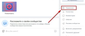
To set up an action button in VK, go to the settings of your community and scroll down. Opposite the line “Action button” - click enable.
Below, in the “Action Type” item, select one of the options:
- write by mail;
- make a phone call;
- call VK;
- open the website;
- open the community application;
- open the mobile application.
Select the desired item. For example, select “Open website”.
After this, you need to specify the site address and select the name of the button. On our button there is the inscription “More details”.
Depending on your choice, you may need to specify a phone number, administrator, email, website or mobile application address.
Buttons with calls to action in VKontakte ads: your new weapon for high conversions
Are you placing an advertisement in the VKontakte news feed and want to know how to get more applications, calls and subscriptions for the same money?
Or maybe this tool has not yet been used and you want to use it as effectively as possible at the start? In our first post we will talk about the recent innovation of VKontakte. It allows advertisers to get much more value from placing paid ads in the news feed. This new tool is active buttons in ads or CTA buttons (call to action buttons).
Considering that today the only payment model for promoted posts on VK is uCPM (money is debited as per 1000 impressions), the new feature will help you get much more requests or calls with the same budget. According to representatives of the social network, even 3 times. Well, let’s take the word of VKontakte development director Alexander Kruglov, who bases his statement on internal tests of the social network.
So, what do “Buttons” do, what are they, and what tasks of your business will they help solve much faster?
Starting from November 16, active buttons can be added to promoted posts (in the news feed they are marked as “Advertising post”): “Buy”, “Go”, “Install”, “Join”. In addition, there are more than a dozen options. The choice depends on your cherished goal - to get referrals to an online store, direct a potential client to a dialogue with the community administrator, or even force them to dial your number directly from the VK mobile application. The buttons are displayed not only on the desktop, but also in the mobile version and in official VKontakte applications.
The biggest advantage of the innovation is your ability to force a potential client or subscriber to take the action you need quickly and without unnecessary steps: if you want sales, direct them directly to a product or service; if you want registrations for your seminar, write a link to the registration form; if you want more subscribers, invite users to join your community in one click. Don’t force the user to think, study your materials unnecessarily, reduce the time for making a decision and get much more leads: subscribers, calls, contact information or instant sales. It is important that the tool will help optimize the budget: we pay not for applications and clicks, but for ad impressions in the feed.
For your convenience, we have made this guide on VKontakte CTA buttons. Find out which buttons are best to choose based on the objectives of your advertising campaign and the conversion goals you want to achieve.
You can download this manual in PDF format from the link: checkboxes_cta_to_vk_pdf
What to pay attention to when setting up CTA buttons?
Now, after we have decided on the goals, types and texts of buttons, it’s time to move on to setting up a CPA campaign. It is worth noting that there are a number of nuances here, so we decided to tell you about them.
We won’t dwell on targeting settings and choosing bids; let’s move straight to working with the advertising record.
So:
- Go to the advertising account (section “Targeting”) and select the advertising type “Record in the community”. VKontakte will offer us to create a new post or select a ready-made one. However, you can only advertise the entry of the community whose administrator you are.
By the way, not many people know that you can promote posts on VKontakte without publishing them in the community (hidden advertising posts). They will only be seen by the target audience of the advertisement, and they will not be displayed on the community wall or in the news feeds of subscribers.
2. Let's say we already have a post that has proven itself well virally (that is, it received a good response from subscribers without advertising). Copy its link into the window and open it for editing.
3. Click on “Add link” (third icon under the advertising post) and enter a link that should be relevant to the target action we expect. In our case, this will be a transition to dialogue with the community. Save and move on to the next stage.
4. Here “VKontakte” will ask us to choose the text of the button: “Write”, “Contact”, “Join”, “More” or “Go”. It is important for us to invite the user to chat, so in our case we select “Write”.
5. Click “Save”. But that was not the case, VKontakte will ask us to remove all links from the ad text. There can be only one link - the one that will be written in the button.
6. Save. And again we fail: the text is too long. VKontakte allows us only 220 characters.
7. We mercilessly cut the post, leaving only the most important things. We try to save again without success - two line breaks are not allowed.
8. After the correction, we encounter another problem: we will have to discard the attached image. Instead, there is an option to insert an image for the link. Its dimensions should be 537x240 px - this is smaller than the usual image formats for posts.
9. Hurray! Finally, the ad complies with all the rules, and we can run it, anticipating a flood of messages to our operators.
Well, VKontakte turned out to be quite strict regarding the CTA advertising format.
We summarize the general requirements for advertising materials for this type of ad:
- There should be no links in the ad text itself.
- The maximum number of characters is 220 characters.
- More than two line breaks are not allowed in an ad.
- Attachments are prohibited. It is acceptable to add an image for the link with a size of 537×240 px.
And these, in our opinion, are essential technical requirements for all promoted VKontakte posts. On a note:
- You can only promote posts published on behalf of a community that you are an admin of.
- You cannot advertise recordings of closed or private groups or private events.
- Only one advertisement can be created per record in the system. Tricks of spreading identical ads across different advertising accounts won’t work either.
We wish you effective advertising campaigns and more quality leads!
And be sure to test “Buttons”.
Your Checkboxes
How to add a map with all company addresses
To add or change an address. Opposite the “Addresses” field, set “Enabled”. And put a tick in the “Show map” field so that a map with addresses is displayed in the group and you can see where you are.
Add the addresses where your offices or representative offices are located. Head office, when adding Fr.
When a user views a group, the list will display the address that is closest to the user right now. To add more than one address, in the same “Addresses” tab, click “Add address” below.
This is interesting: How to set up targeted advertising in VK
How to add products to your personal page on VK
On your personal page, as well as in a group, you can create your own personal online store. Moreover, many people do just this - this allows them not to create a group and not waste time and money on its promotion and advertising.
So, in order to post products on your personal page and start selling them, you need to do the following:
- in the left menu select the “Products” tab;
- a list of all offered services will open;
- at the very top find the “Add” button;
- A familiar window will open with a card in which you need to fill out all the fields.
- Click “Create product”.
In order for the post to appear on the wall, you need to check the box next to “Share with friends.”
In the “My Products” section, you can edit existing offers, delete them, lower or raise the price, and so on.
You may be wondering: “What is cashback and how can you use it to save on online purchases and more?”
Schedule
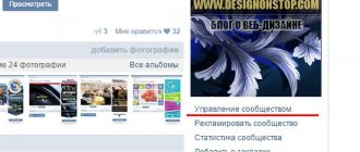
You can specify the work schedule in VK for each branch separately. To do this, either when adding an address or after, open it in the settings and in the “Opening hours” field select “Open during specified hours.”
And for each day of the week we set the opening hours. Finally, click “Save”.
If you want to delete one of the addresses, then opposite it you need to click “Edit” and at the bottom of the window that appears, find and click “Delete”.
Menu for VK group
You need to do it from the beginning (in a graphic editor).
The menu size is as follows: – maximum width 600 px (this is most convenient) – height as desired.
I made this menu:
VK group menu picture
Now in Photoshop (using the “Cutting” tool) I cut the menu into equal parts.
the entire layout mode into equal parts
In Photoshop, click File → Save for Web...
I select all the parts and save them in Png-24 format.
In the end I ended up with 12 parts.
Wiki markup is not designed to display correctly in mobile applications. Therefore, always cut the menu into equal parts or make the menu in one column. Then your menu will look the same on PC and in applications.
Now all the resulting pieces need to be uploaded to the group’s album.
For this purpose I am creating a separate album called “Technical”. There I transfer both the avatar and the header image.
We return to the created MENU page. If you forgot, it is located at this address https://vk.com/pages?oid=-123456789&p=MENU Don’t forget to replace 123456789 with your group number.
To go back to editing mode, you need to click the Pencil icon in the upper corner.
Click to edit
Now we need to build a table from our cutting in which the pictures will be link buttons, and those places where there is no button will not be clickable.
The table in VK begins like this: {| and ends like this:|}
Always make the menu a table so that the buttons don’t jump when you watch the group through the application
In general, we write like this (but with our own meanings):
{|noborder;nopadding |- | [[photo-176307581_456239020|300x100px;nopadding;nolink| ]] | [[photo-176307581_456239021|300x100px;nopadding;nolink| ]] |- | [[photo-176307581_456239022|300x100px;nopadding|https://vk.com/topic-176307581_39164350]] | [[photo-176307581_456239023|300x100px;nopadding|https://vk.com/topic-176307581_39164350]] |- | [[photo-176307581_456239024|300x100px;nopadding|https://vk.com/topic-176307581_39164350]] | [[photo-176307581_456239025|300x100px;nopadding|https://vk.com/topic-176307581_39164350]] |- | [[photo-176307581_456239026|300x100px;nopadding|https://vk.com/topic-176307581_39164350]] | [[photo-176307581_456239027|300x100px;nopadding|https://vk.com/topic-176307581_39164350]] |- | [[photo-176307581_456239028|300x100px;nopadding|https://vk.com/topic-176307581_39164350]] | [[photo-176307581_456239029|300x100px;nopadding|https://vk.com/topic-176307581_39164350]] |- | [[photo-176307581_456239030|300x100px;nopadding;nolink| ]] | [[photo-176307581_456239031|300x100px;nopadding;nolink| ]] |}
Instead of photo-176307581_456239020 and the like, we replace it with the numbers of our pictures.
You can find them out like this:
- Go to the album of the group “Technical”
- Open the first photo of the menu piece
- In the address bar, copy the part with the number of this picture (there are a lot of numbers, photo- is written before the one we need)
address of the picture for the menu in vk
And we do this with each picture of our menu for the VKontakte group.
And instead of https://vk.com/topic-176307581_39164350 we write a link to the page we need. I usually create these pages as Discussions (for this they need to be activated through the Management settings)
We do this with each button.
Those images that are not a button have the value [[photo-176307581_456239030|300x100px;nopadding; nolink | ]]. When you click on such a picture, nothing will happen.
At any time during editing, you can see what you are doing. To do this, click on the View tab.
View will show your current score
pros
On VKontakte you can now maintain a full-fledged blog. If you already maintain a personal page, information from there is now easier to transfer to VK, because there is no loss of structure. Well-labelled material is enjoyable to read. There are no endless distracting emojis that were previously used to bring at least some order to the text.
Examples of people who might benefit from this feature? Everyone! The mere fact that pictures can now be inserted between blocks of text will help both those who write instructions and those who talk about travel. And the audience, of course.
We recommend: How to draw graffiti on VKontakte
For the reader, an additional advantage of such a post over a regular one is the presence of a night mode.
